Project type:
Published
Client:
Space Nation
Helsinki
Employer:
Kobra Agency
Helsinki
Fonts:
NB Akademie,
Gagatin (Custom)
Case images:
Carl Bergmann
at Duotone
Collaborators:
Tuukka Koivisto,
James Zambra
Space Nation is a Finnish startup that aims to bring space travel within everyone’s reach. The Space Nation product portfolio consists of: The Space Nation Astronaut Program, the Space Nation Navigator – astronaut training app, the worlds first online space lifestyle magazine Orbit, an experimental laboratory called Labs on the International Space Station (ISS) not to forget the Space Nation Kids Future Astronaut Program developed together with the Fun Academy.
1
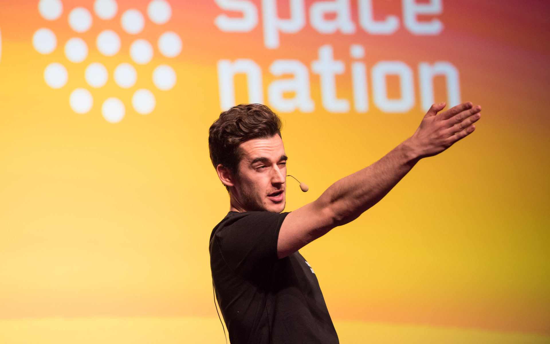
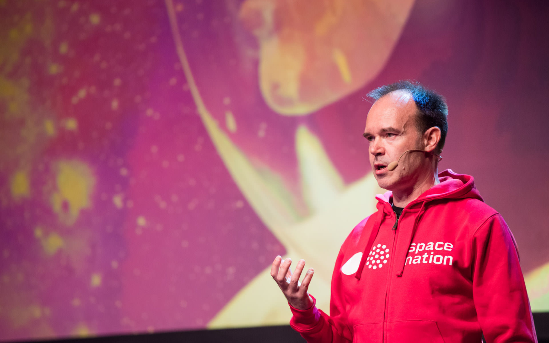
Working closely together with the Space Nation design team led by Sami Sorvali, we created a visual identity that would work for the main brand as well as accommodating all of their sub-brands and products. The visual identity communicates a systematic and scientific feel often associated with space-related operators while demystifying space travel and making it more approachable and fun.
2
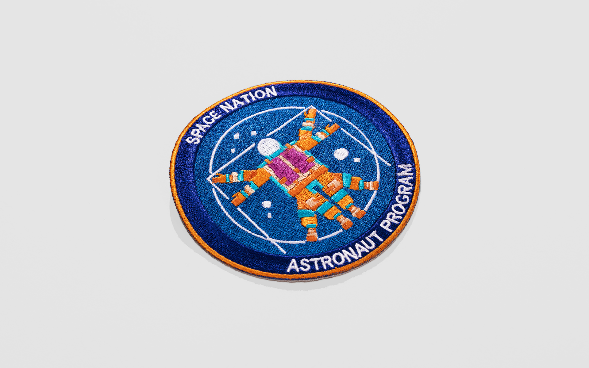
The Space Nation Astronaut Program, designed in collaboration with Axiom Space and Nasa, is an ongoing training program that will offer a range of astronaut training experiences, starting with an app – Space Nation Navigator – and progressing to boot camps, parabolic flights, right through to – eventually – multiple trips to space. The visual language we created, translates the fun yet scientific process in a perfect balance, using gradients colour schemes, brand images, motion design and illustrations. The illustrations are done by Dan Matutina.
3
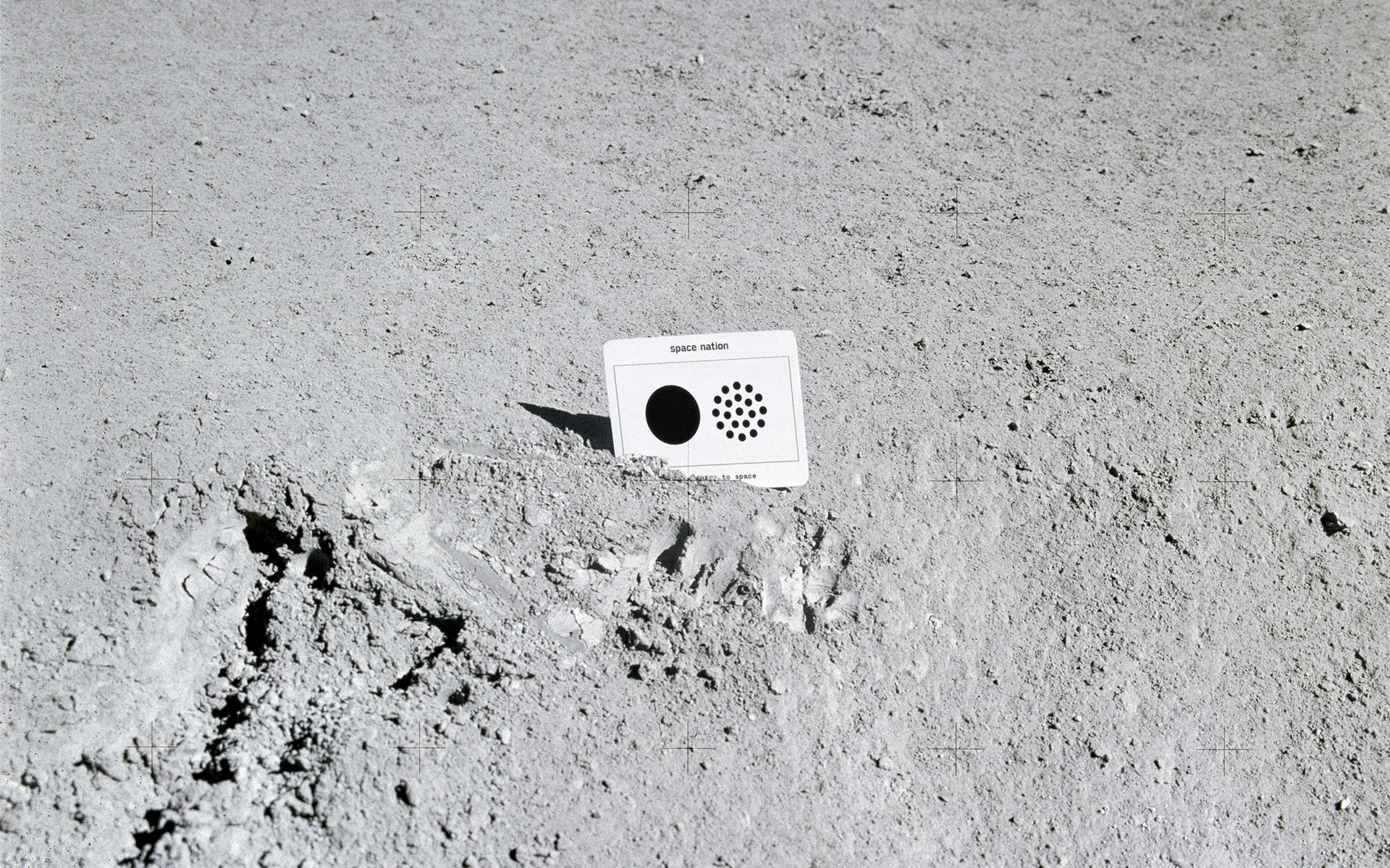
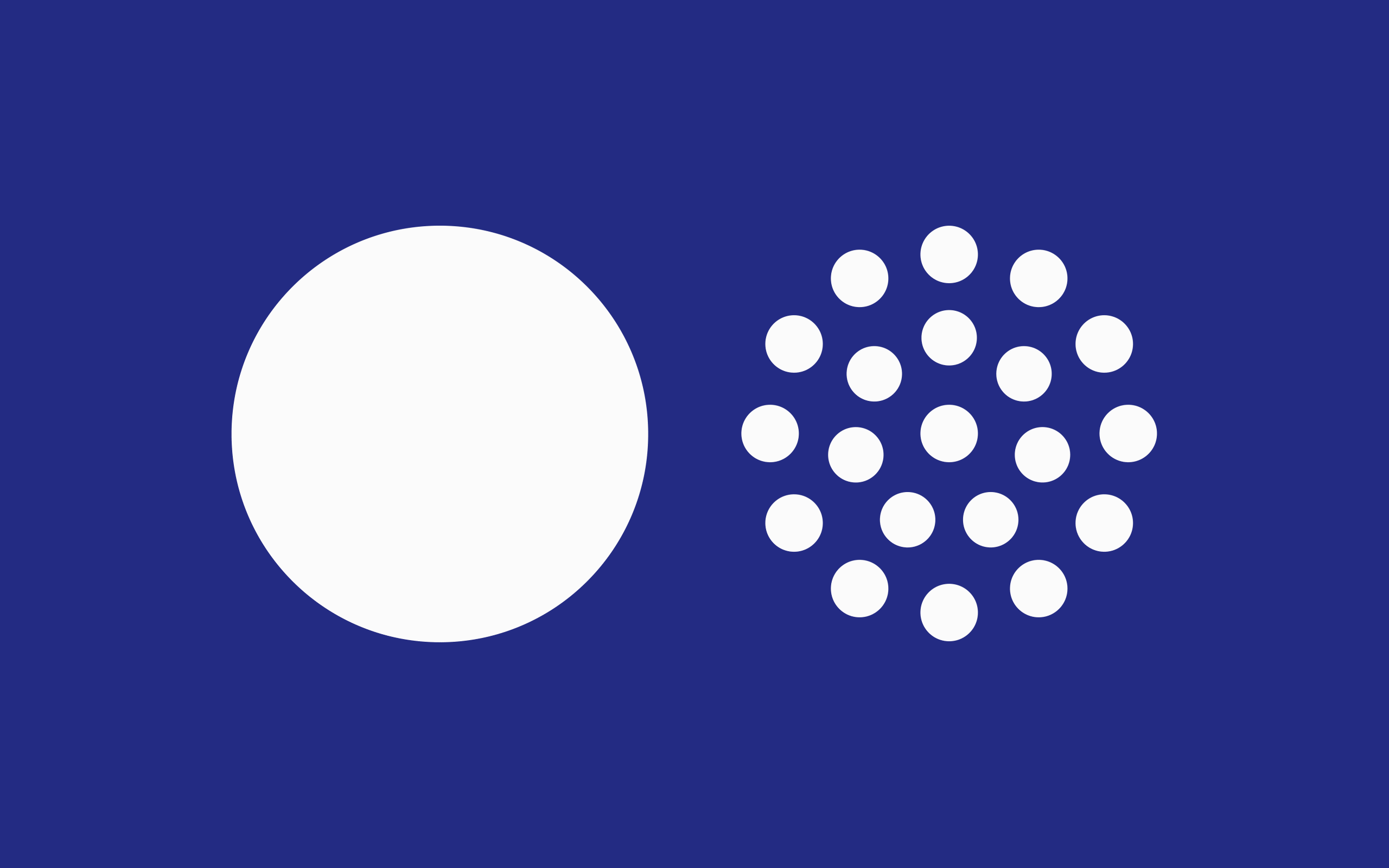
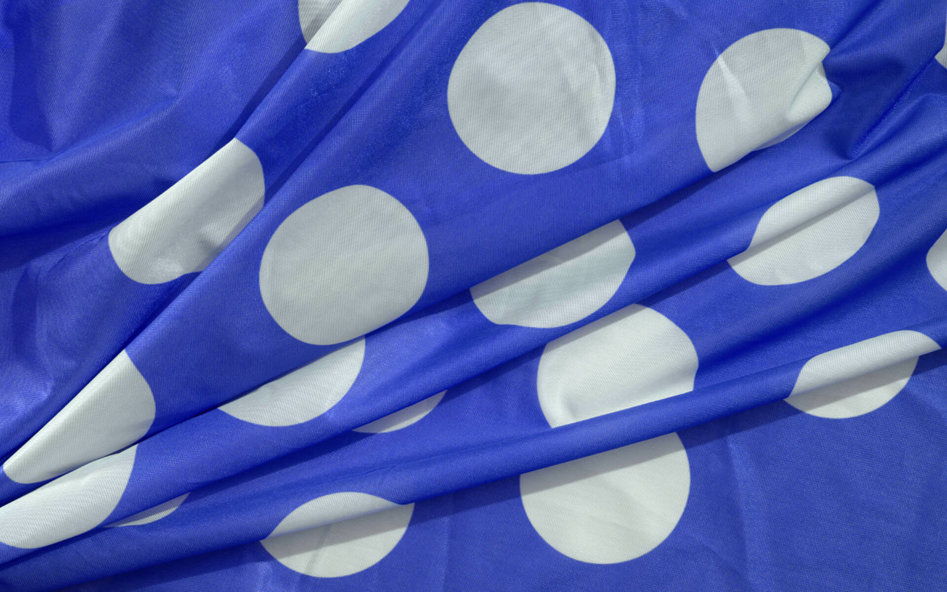
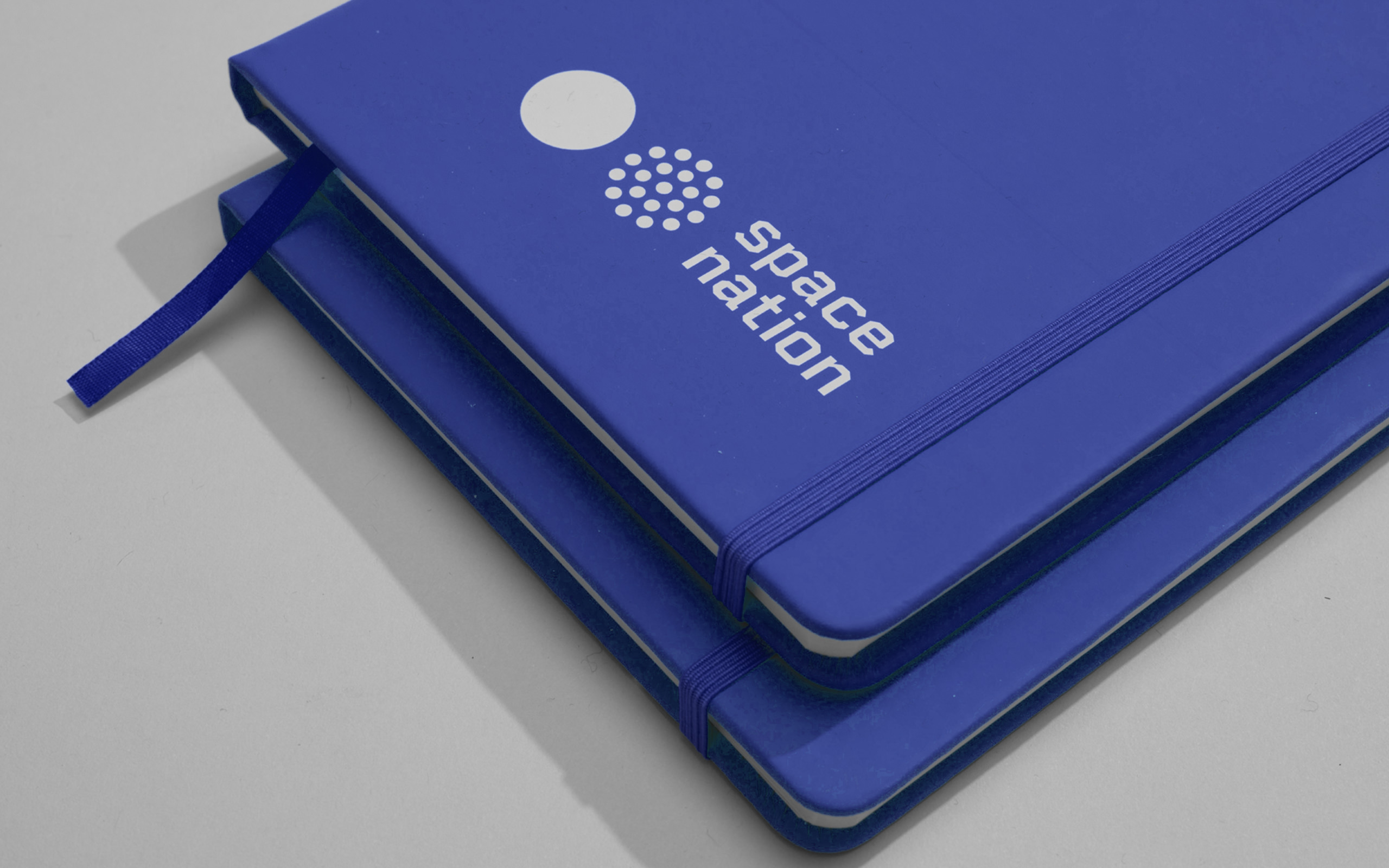
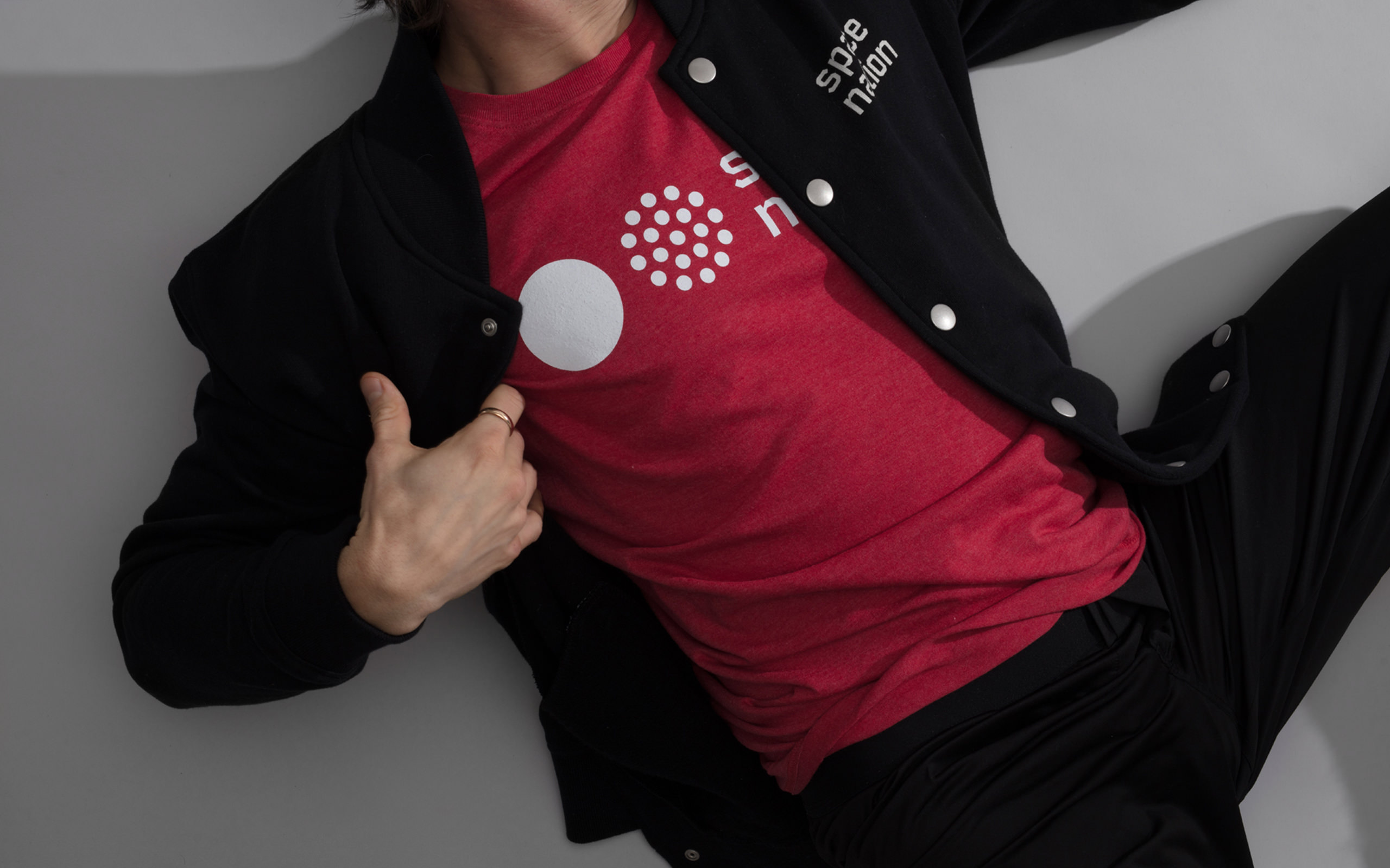
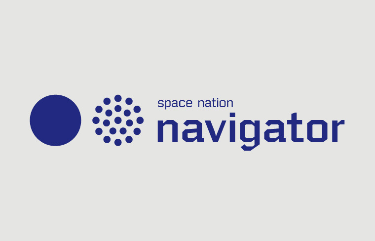
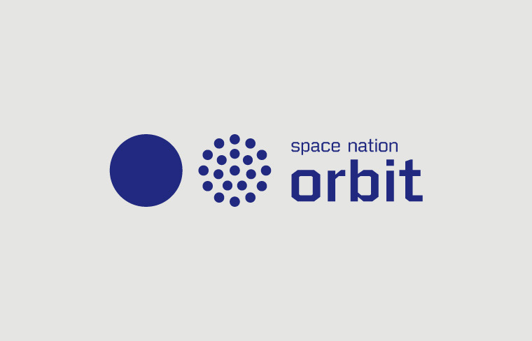
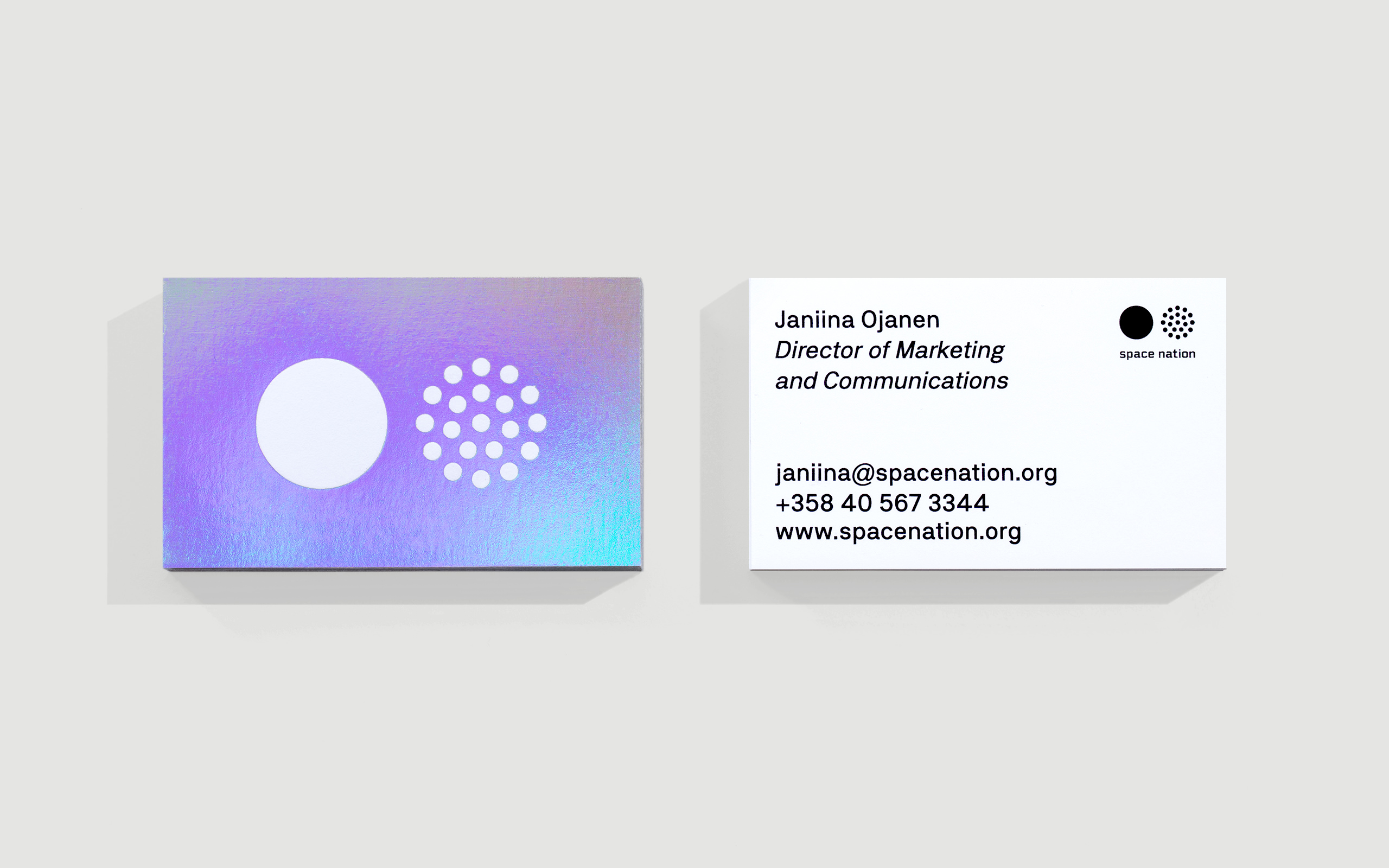
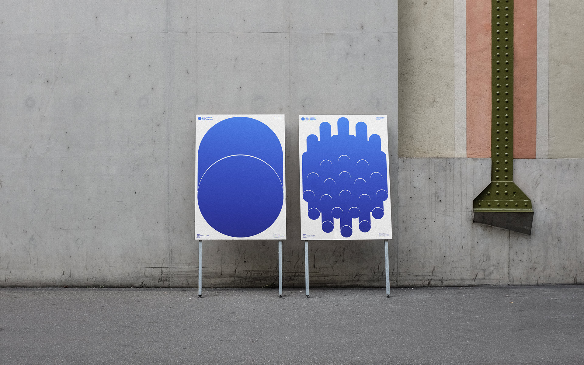
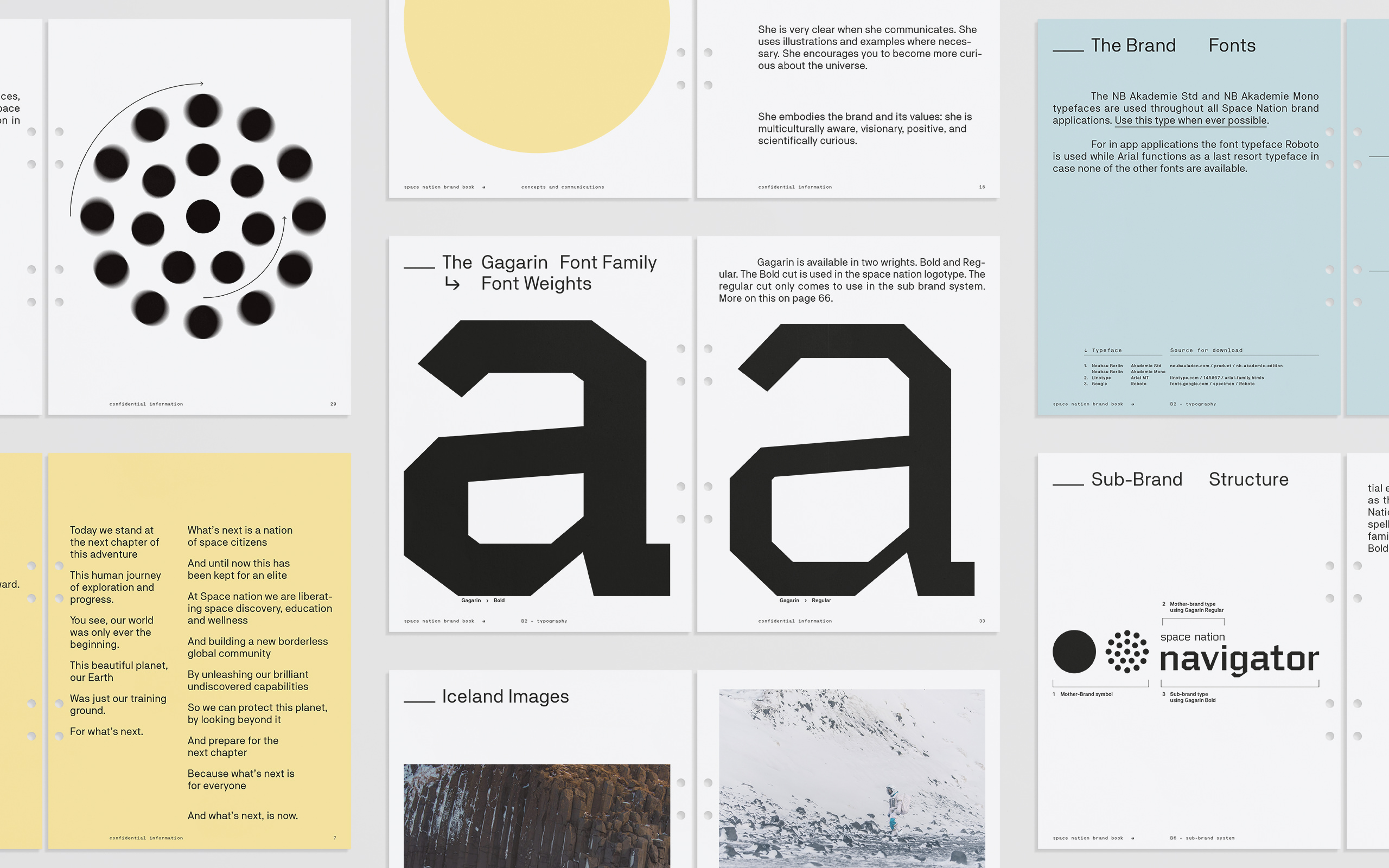
The Space Nation mark is graphic, clear and bold, illustrating the company’s name in a symbolic way. It sets an open and accessible tone for the brand. The logotype represents the more technical aspects of space travel. Combined with the symbol they create a link between us as a nation and space travel.
4
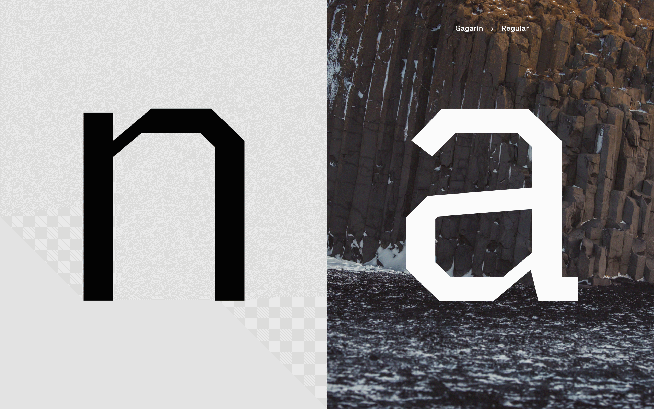
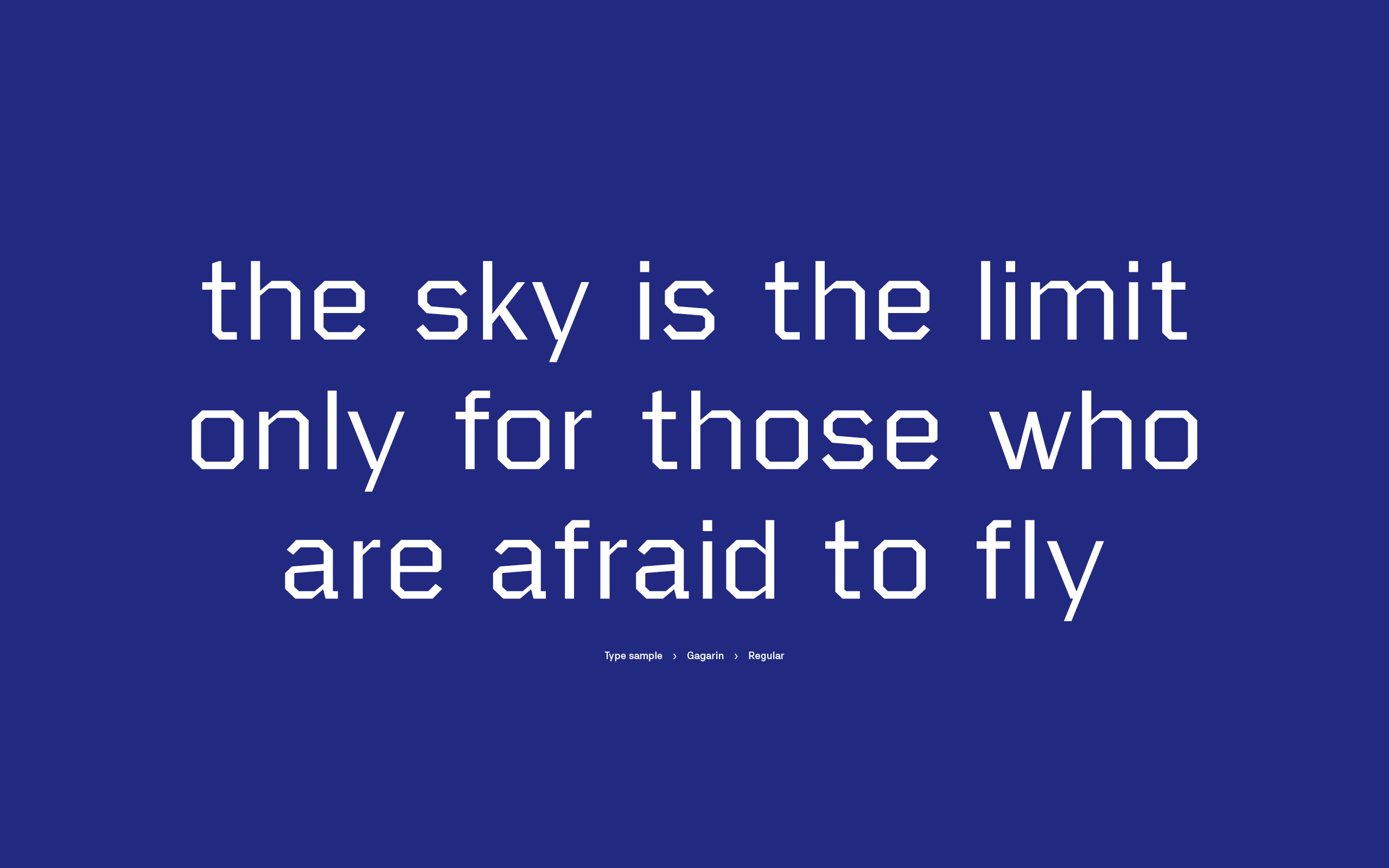
Gagarin is a typeface created for the Space Nation brand. The typeface has a latin character set. It. is used in the main elements of the brand such as the logo and sub-brand logos (products). Its use can also extend further to other elements of the brand.
5
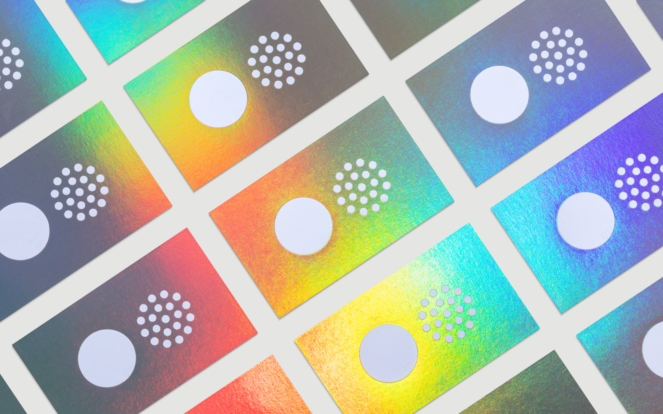
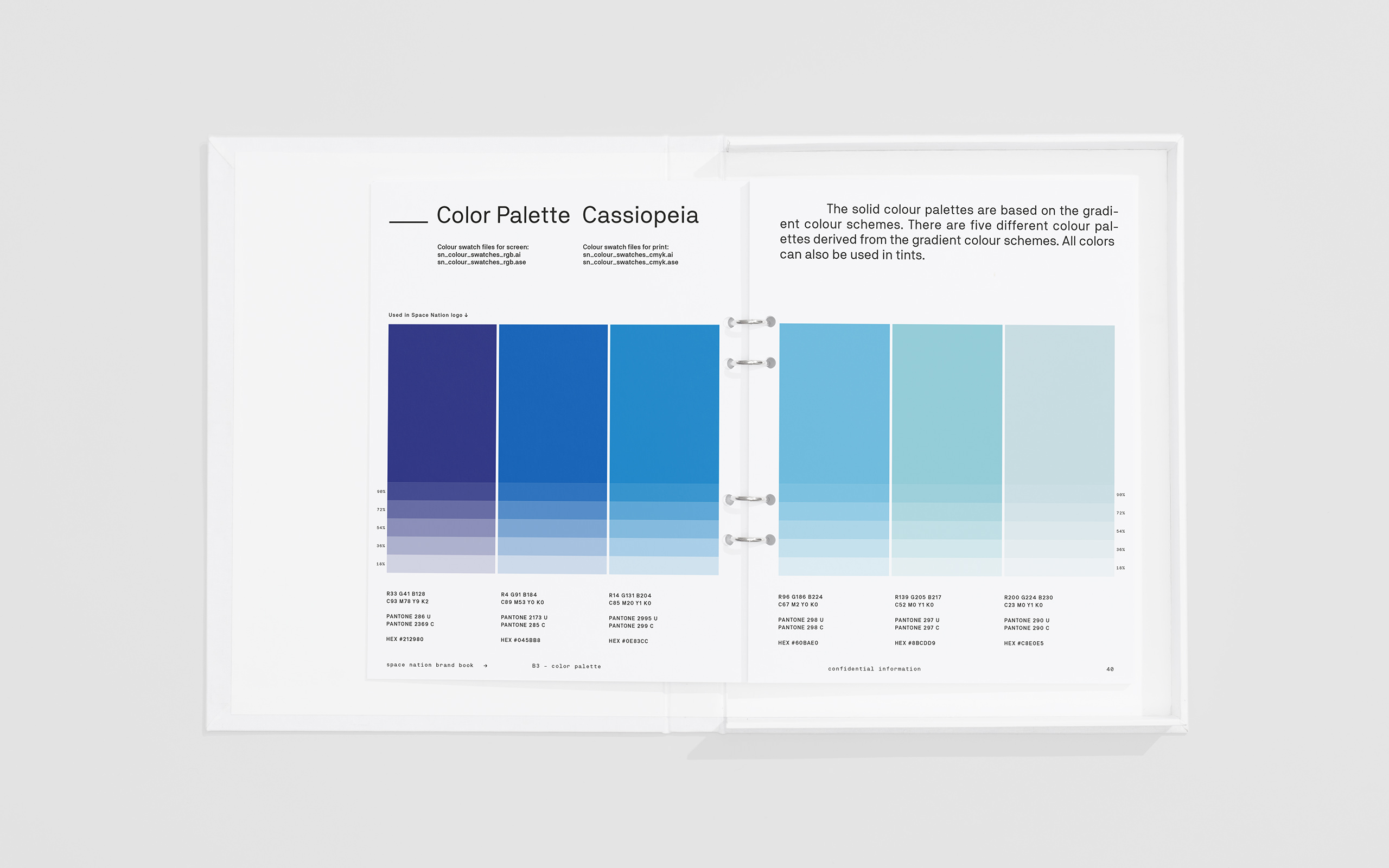
Four different gradient colour schemes were created for Space Nation so that the brand identity would be diverse enough to separate the sub-brands and the mother brand in a recognisable but subtle way.
Based on the four gradient schemes four different solid colour palettes were created. The Space Nation mother brand uses the Cassiopeia colour palette (Blue) as the main colour palette while leaning towards the Hydra colour palette (Red) for accent colours. Gradients and solid colours are used together.
6
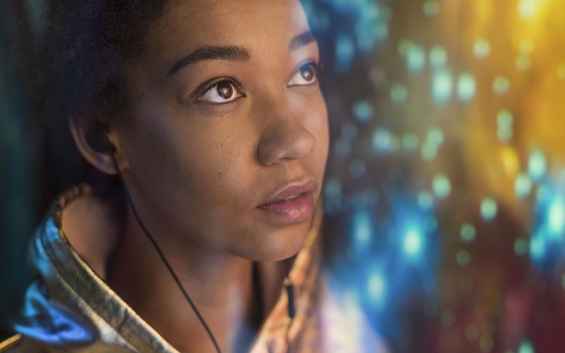
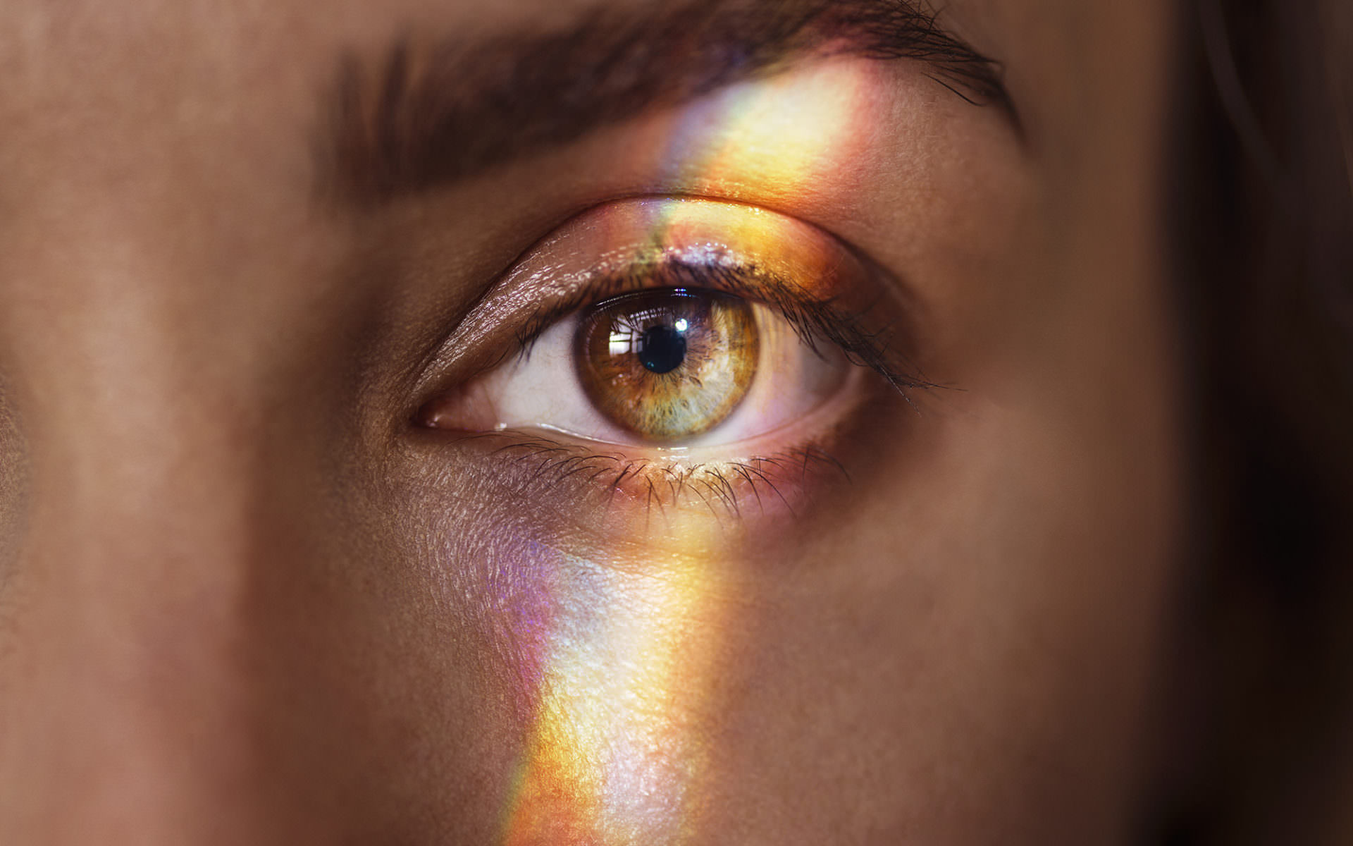
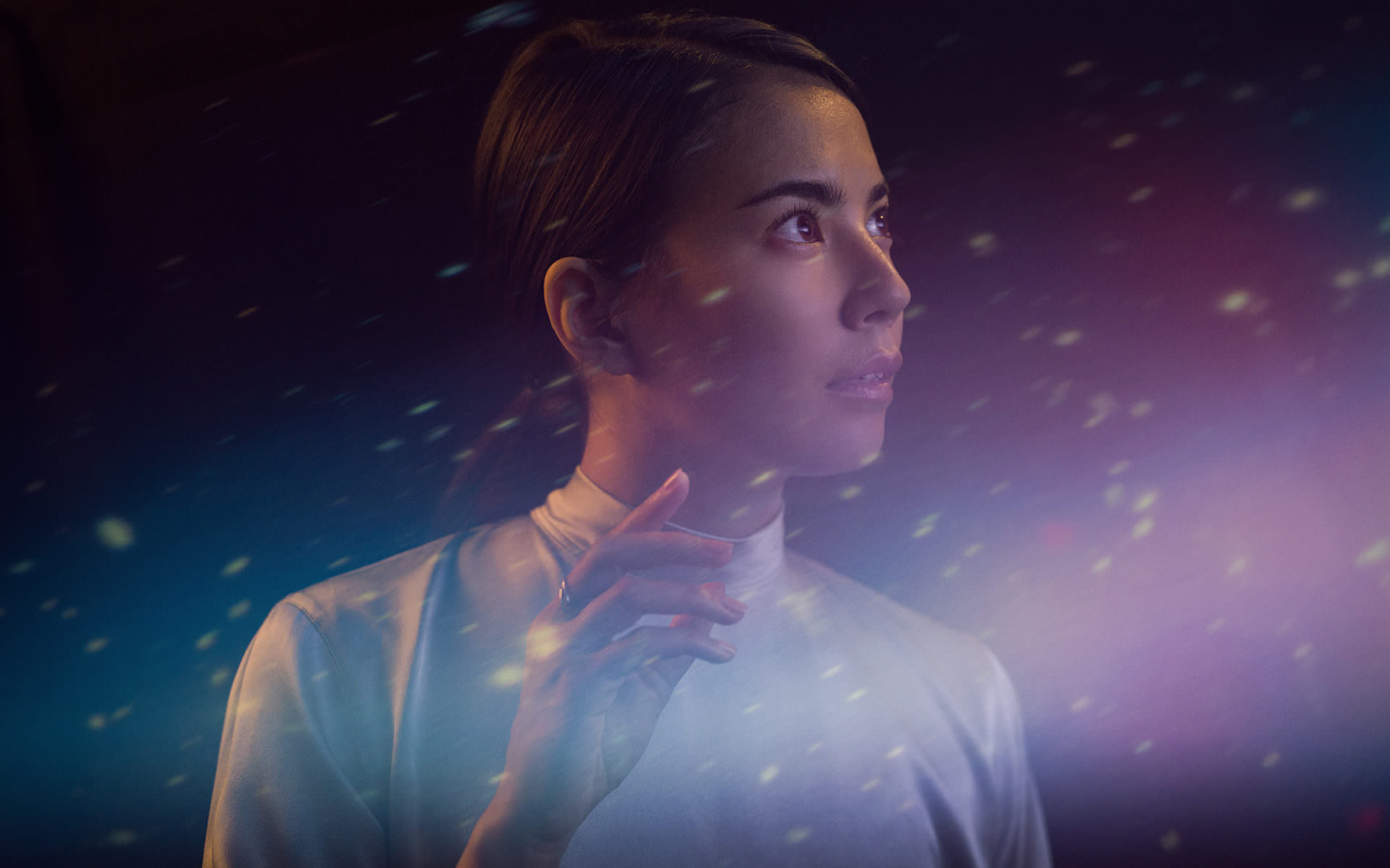
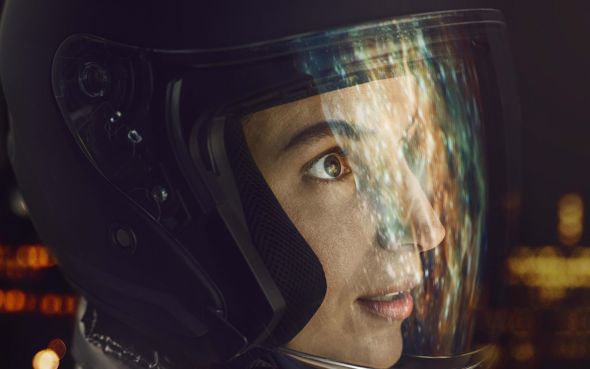
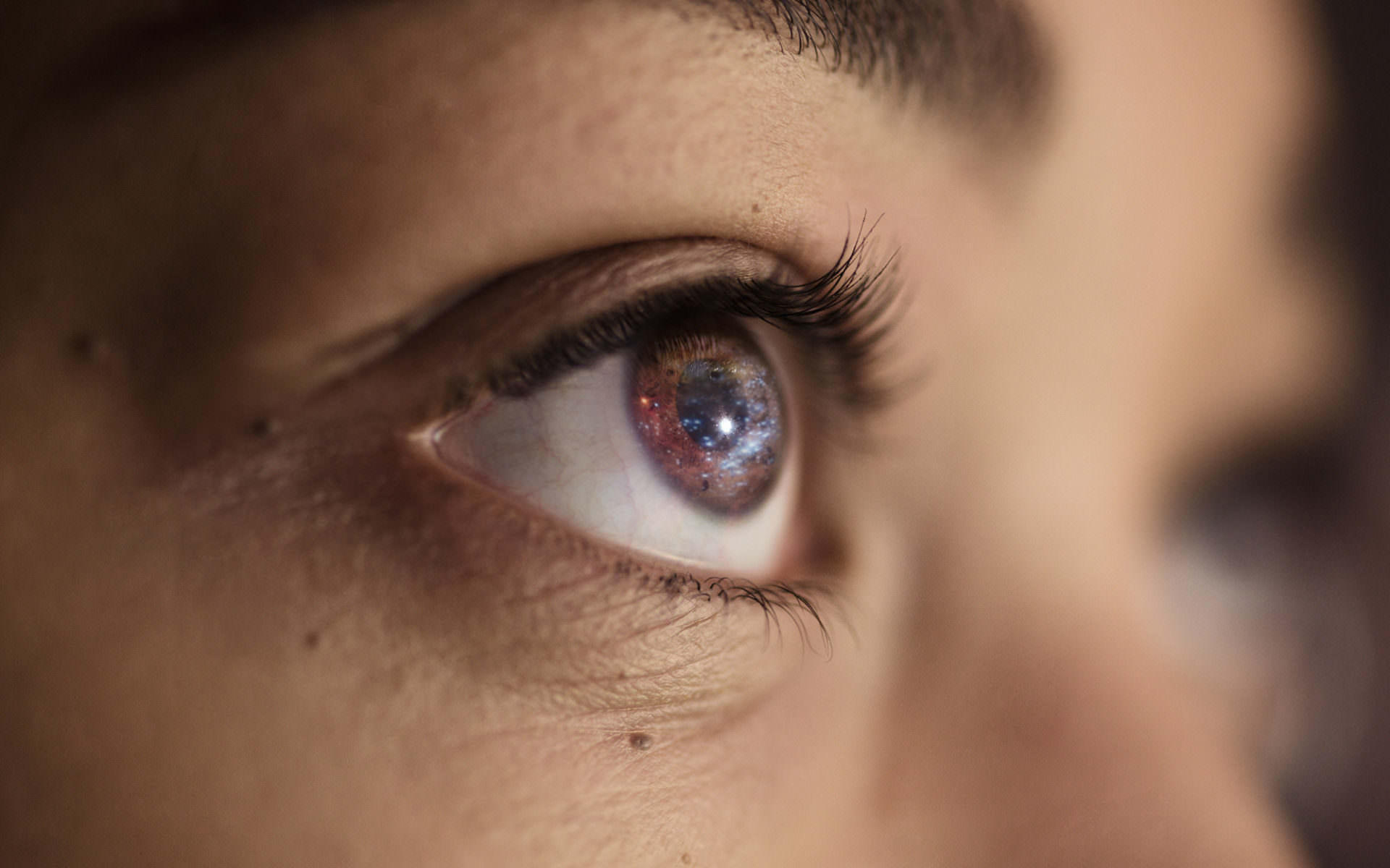
The brand images are organised on three different levels: The Reflection, The Mind and The Eye. The Reflection images have people looking towards the future expressing excitement, awe and hope. In The Mind images, a prism is cast on the persons face with the focus still in the eye. It’s all about learning and being on a constant search for new things. In The Eye images, the individual looks to the sky while the reflections of space are visible in the eyes surface revealing the space inside us all.
7
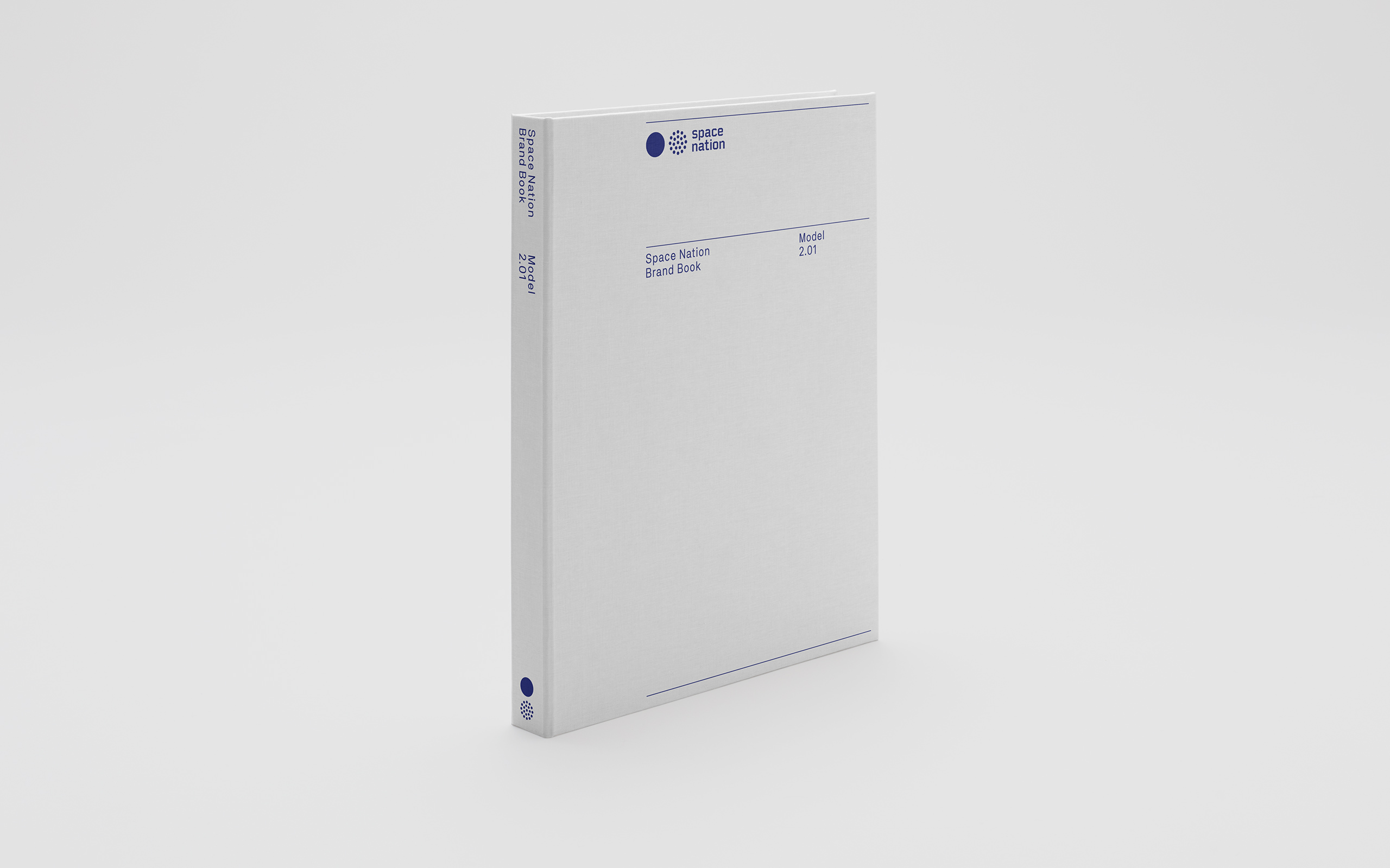
In addition to the e-formats, The visual identity system was compiled into a physical brand guidelines manual. By doing this, the visual identity presents itself to its user in a more tangible way, of course, that creates a more profound experience of the identity and emphasises the importance and value of the designed systems at hand.