Project type:
Concept
Client:
Fictional
Employer:
Basel School of Design,
Basel
Font:
Stanley,
Ludovic Balland
Font:
Neuzeit Grotesk,
Wilhelm Pischer
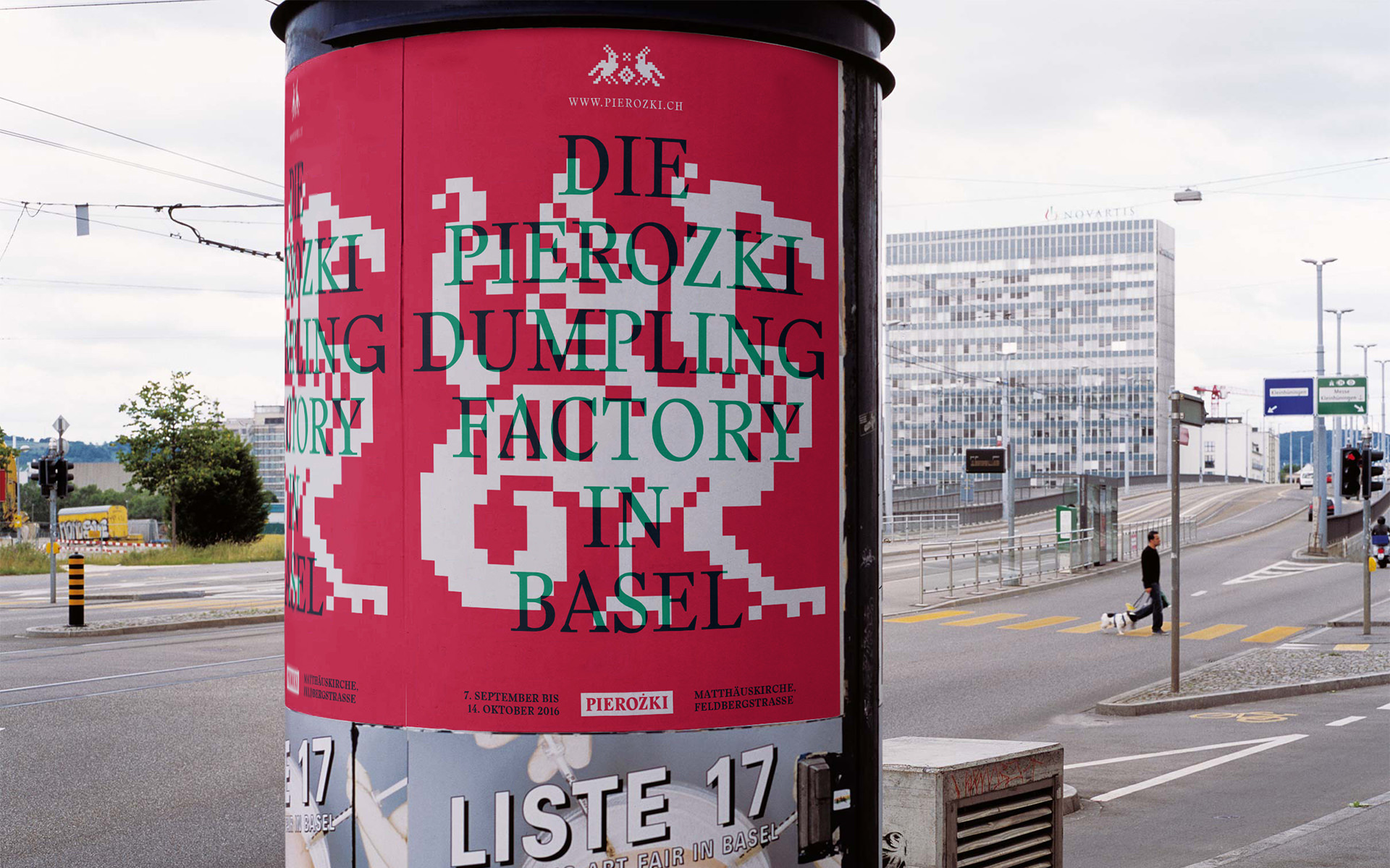
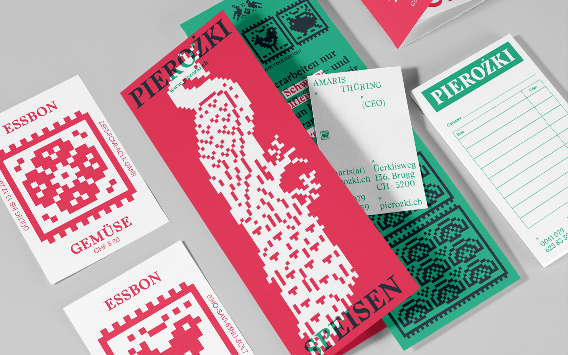
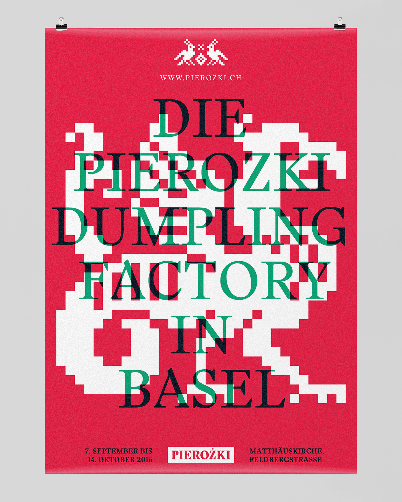
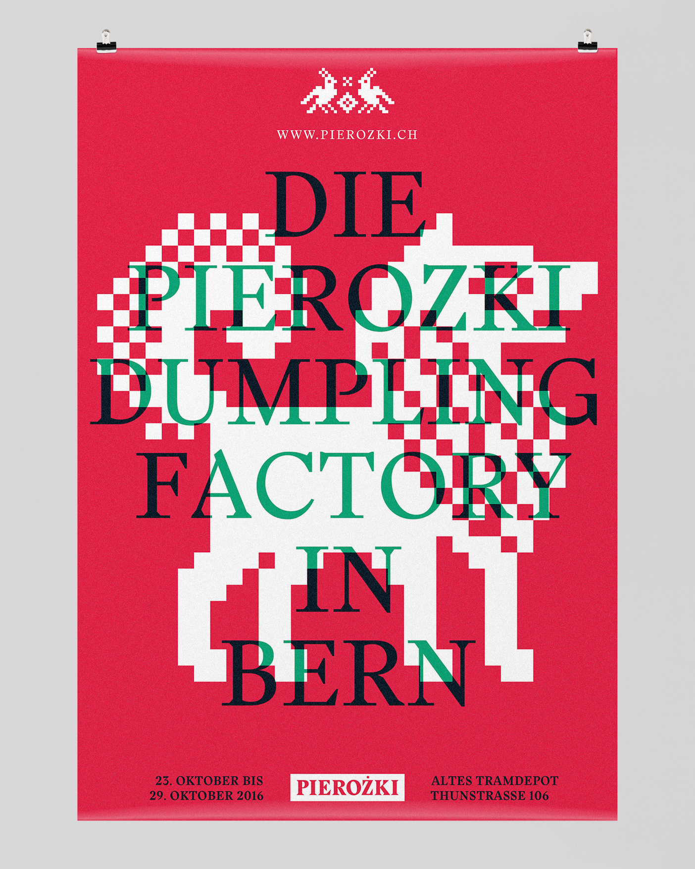
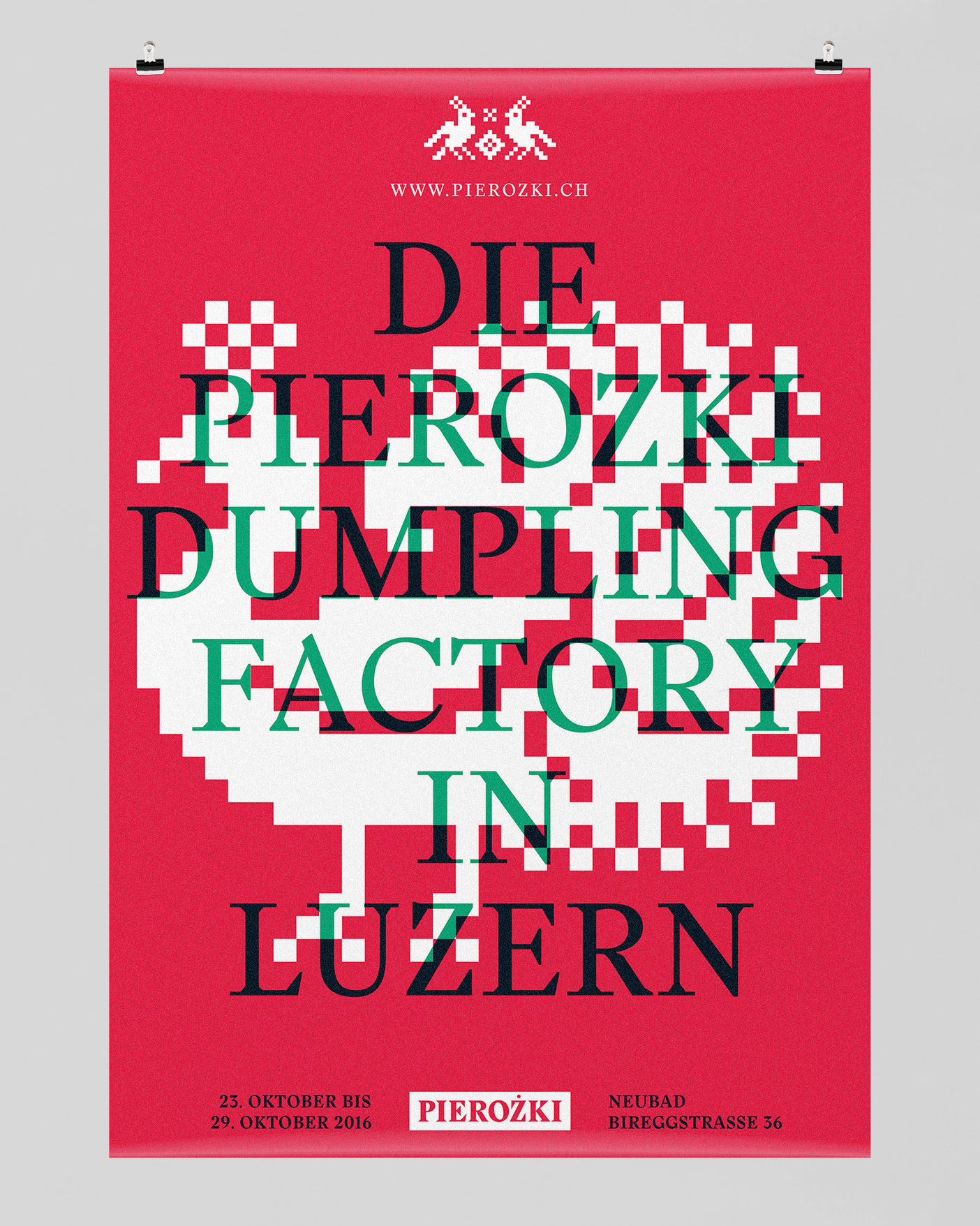
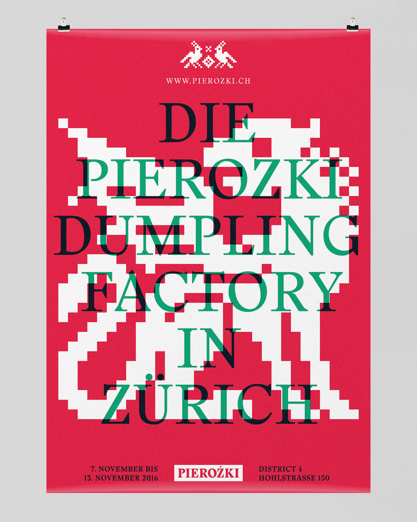
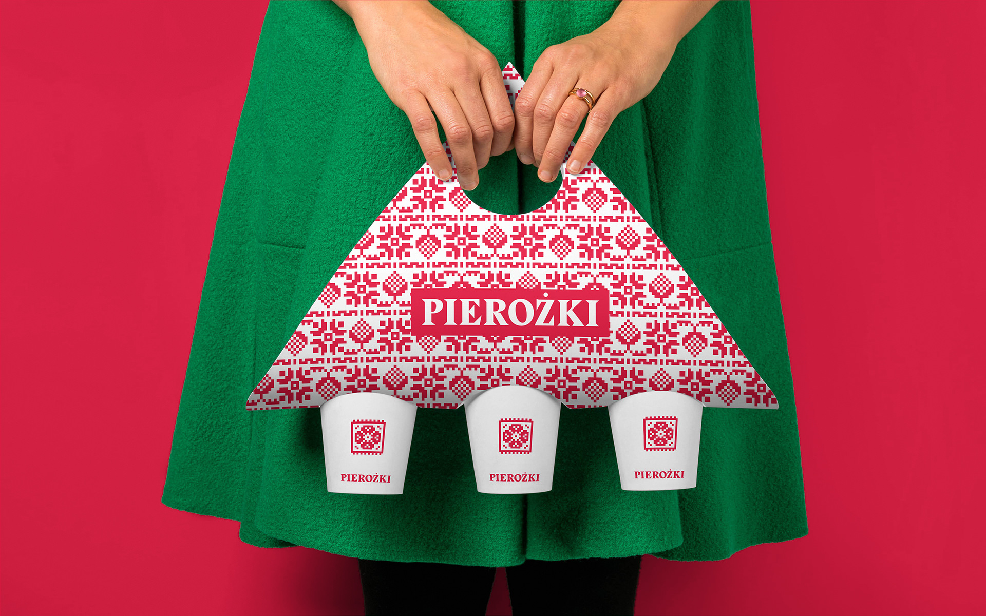
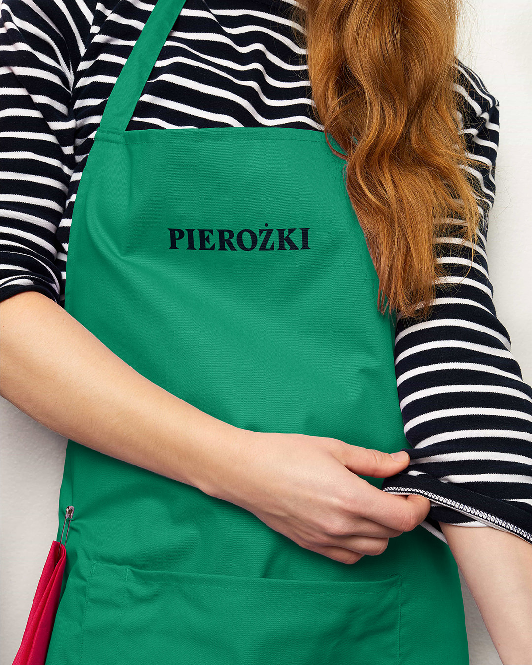
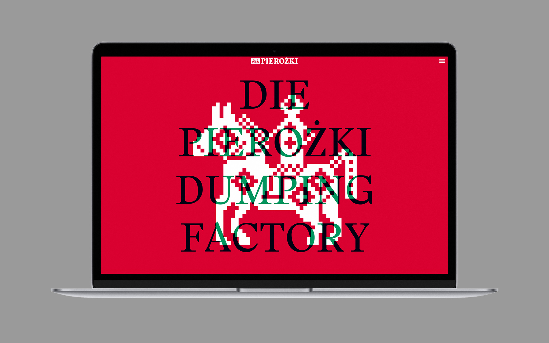
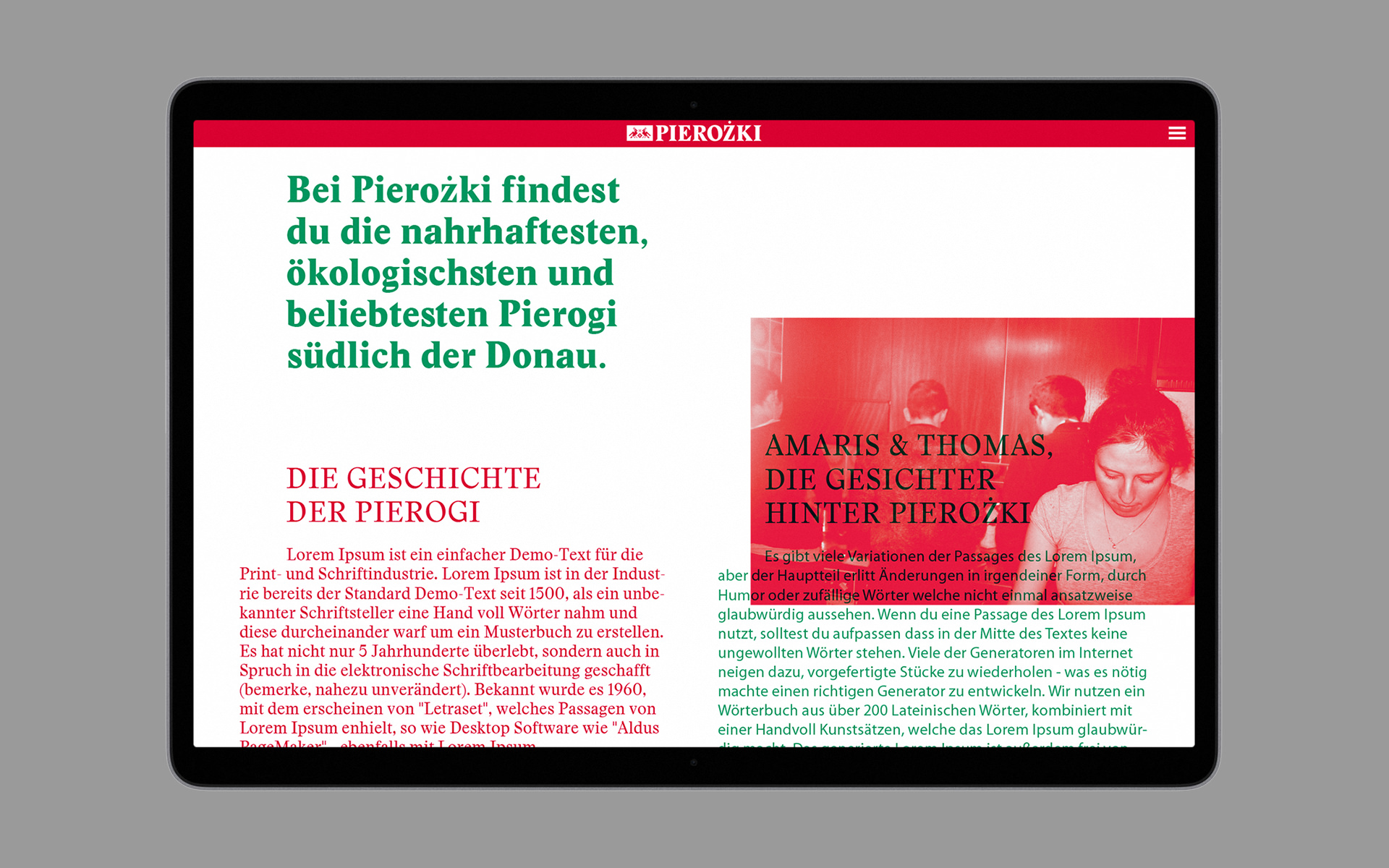
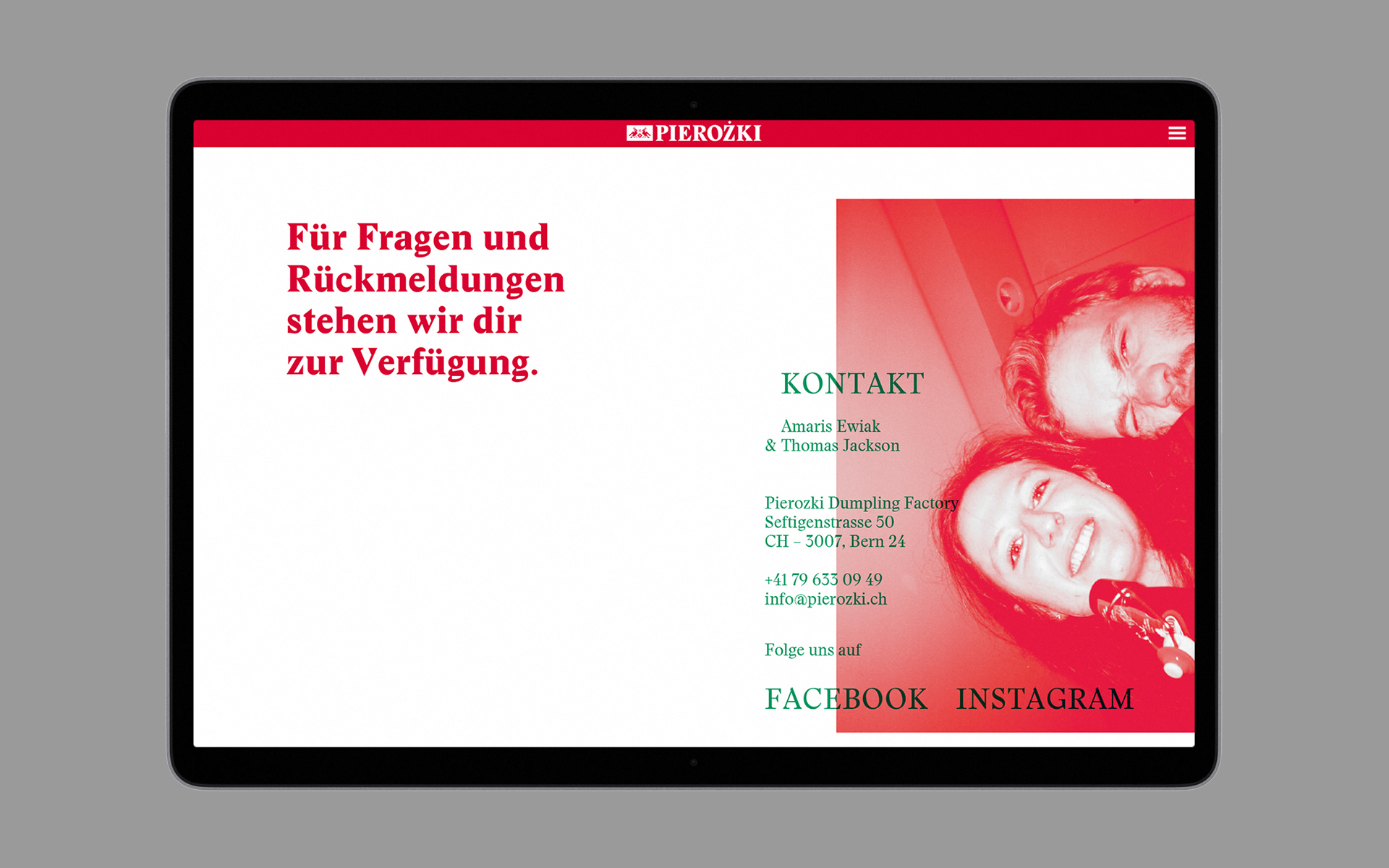
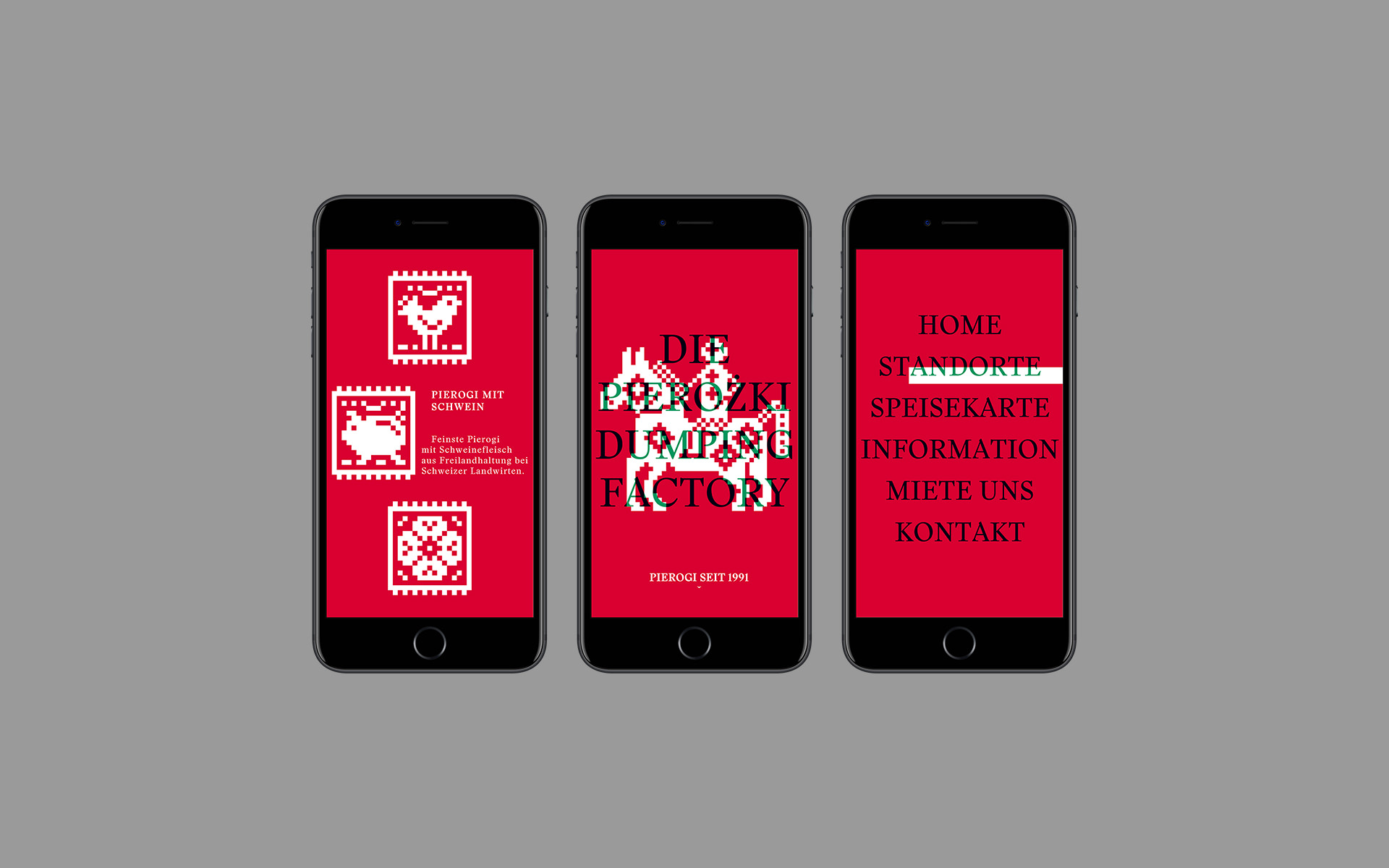
As part of my final exam at the Basel School of Design, I was tasked to create a visual identity for the Pierozki Dumpling Factory. The mobile food truck serves polish specialities with a focus on the famous polish dumplings (Pierogi). The visual identity takes a graphic approach and intertwines traditional polish stitching patterns with a classic typeface and string red and green colours in overprint.
1
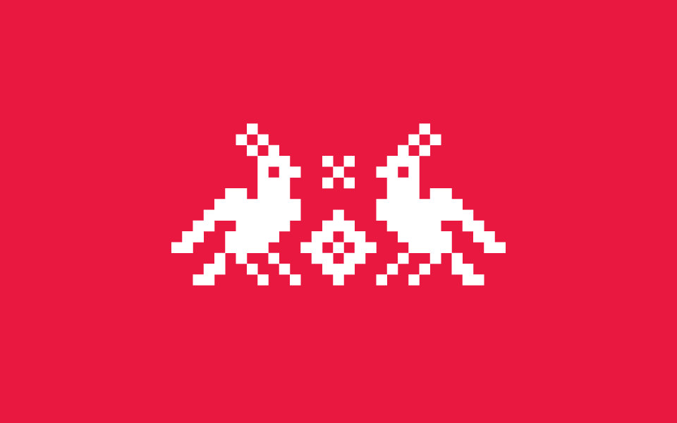
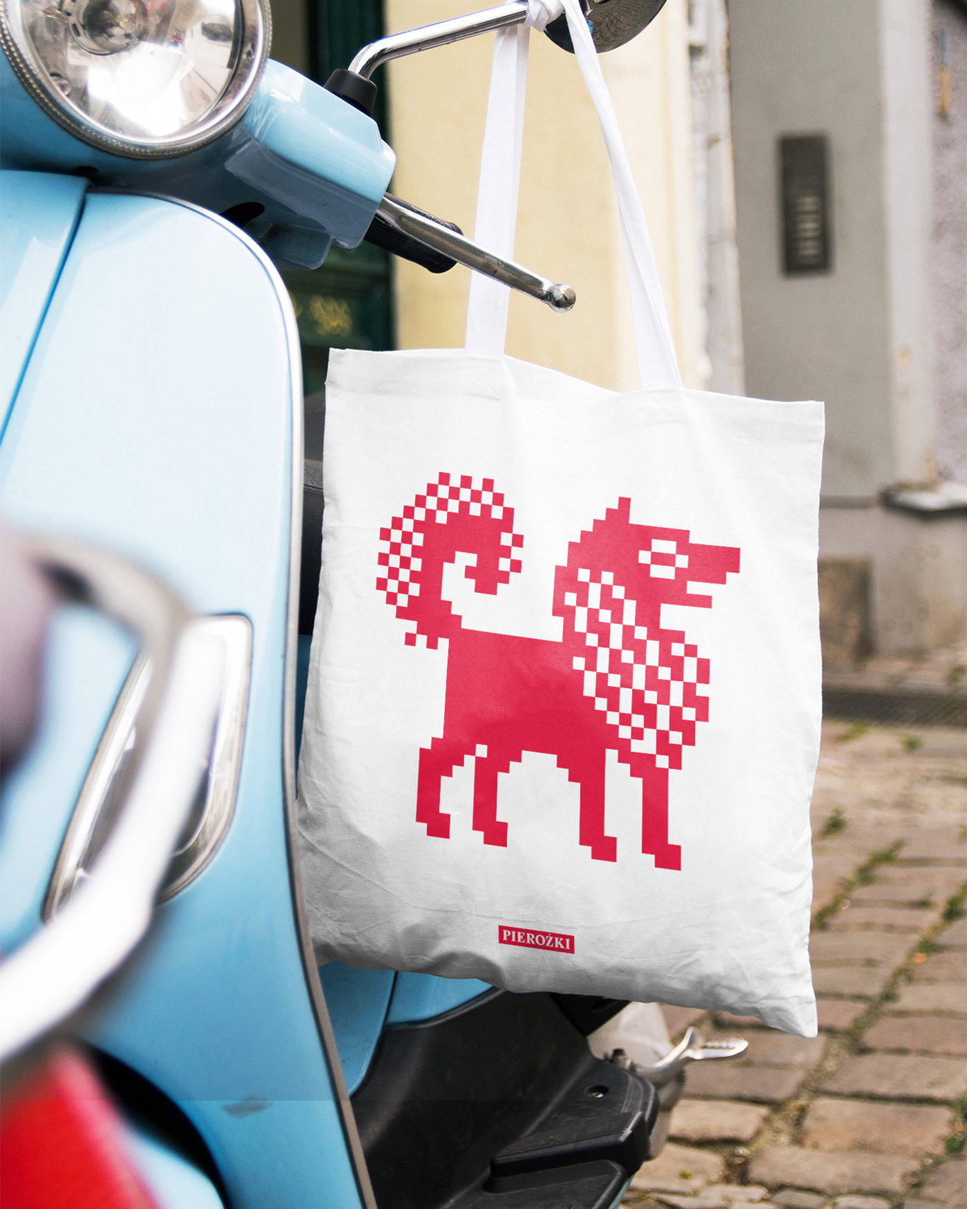
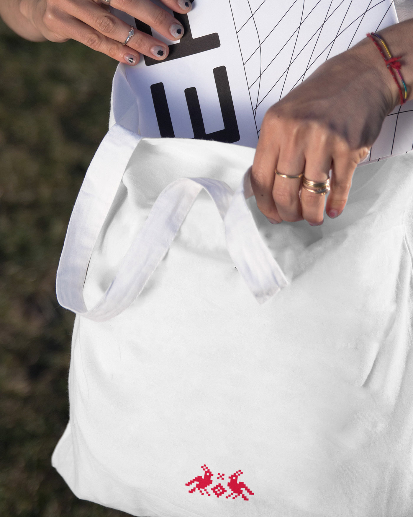
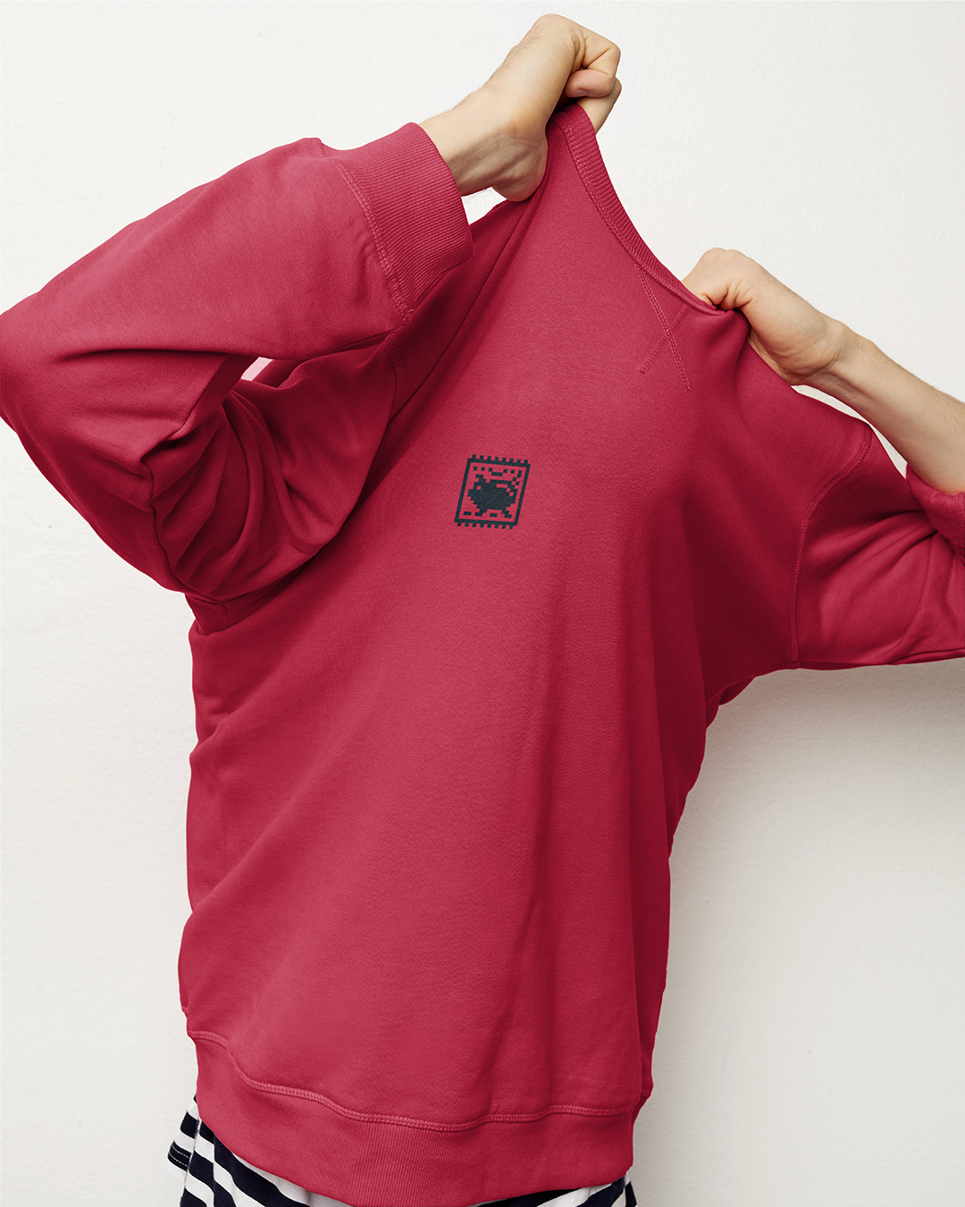
The symbol depicts two white eagles in a red field. The Eagles are executed according to traditional stitching patterns from Poland. The stitching pattern throughout all aspects of the brand and create a strong and recognisable visual language.
2
The red and white colours are taken from the polish flag and combined with the reds complementary colour green. By using the two colours in overprint a black is created and therefore allows for 2-colour prints in all print applications.
With the posters, the overprint method allows for modular combinations of the red and green layers to create unique posters the cities toured by the food truck.