Project type:
Concept
Client:
Berner Design Stiftung,
Bern
Employer:
Basel School of Design,
Basel
Font:
Sectra Display,
Grillitype
Font:
Brown,
Aurèle Sack
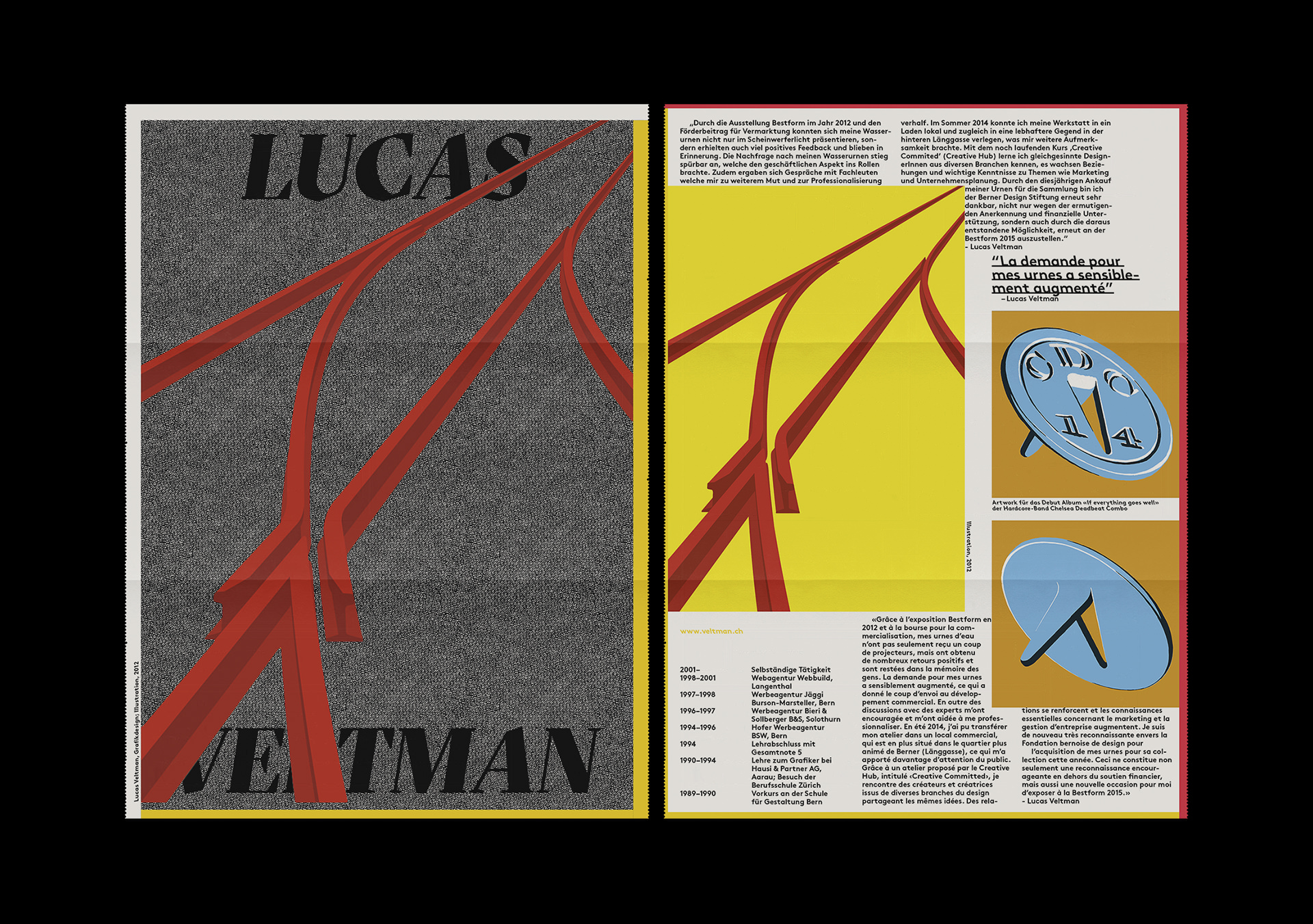
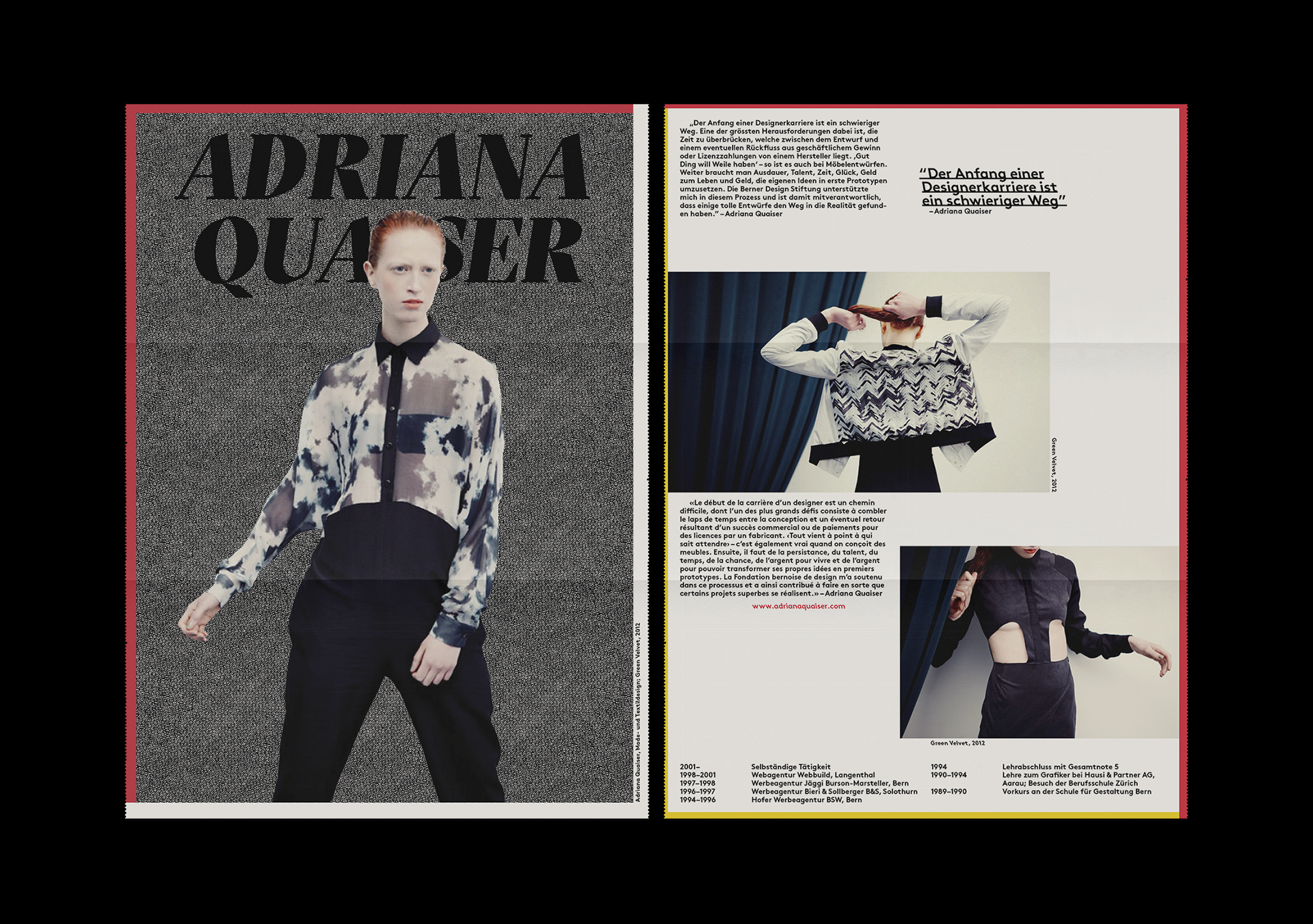
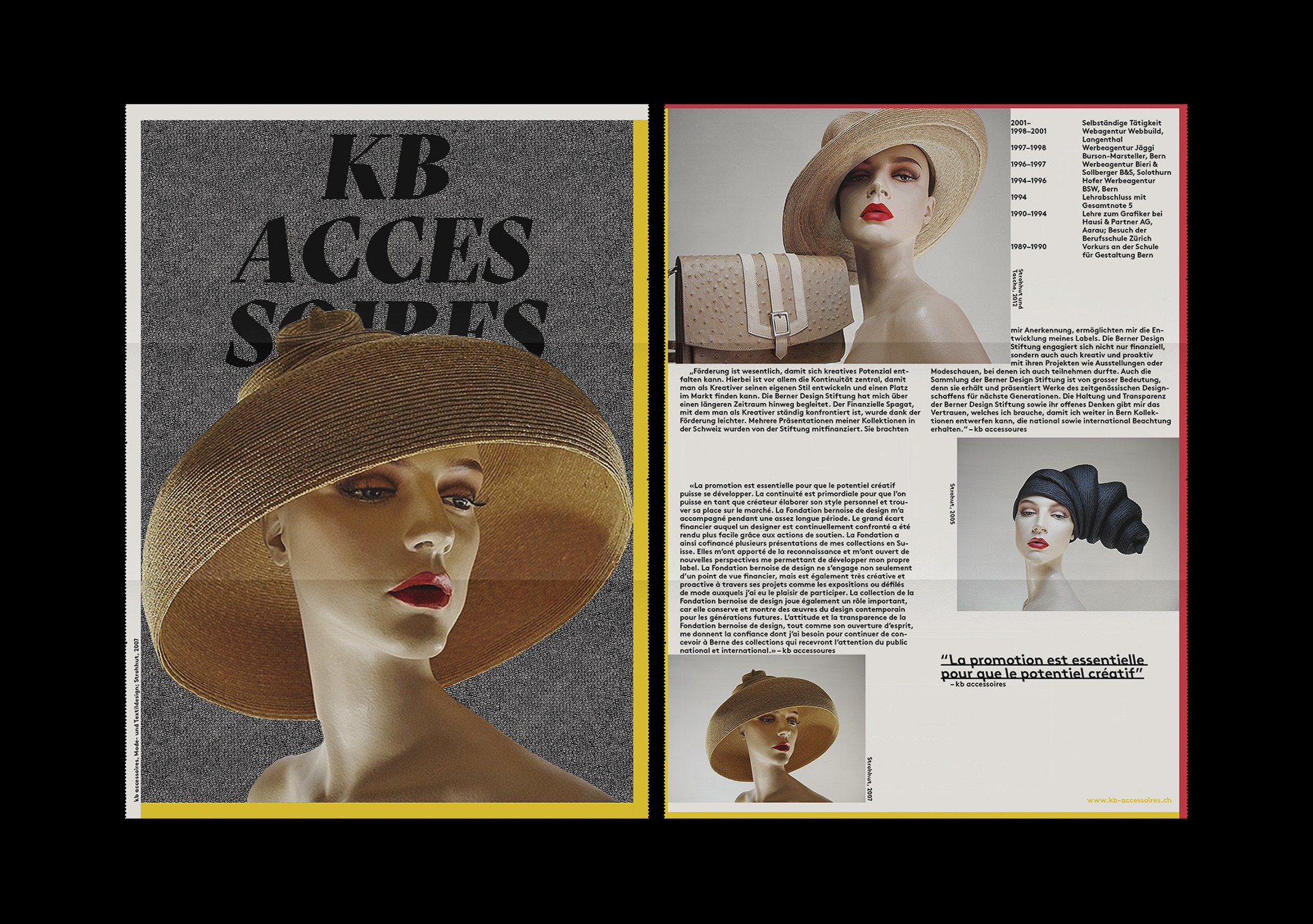
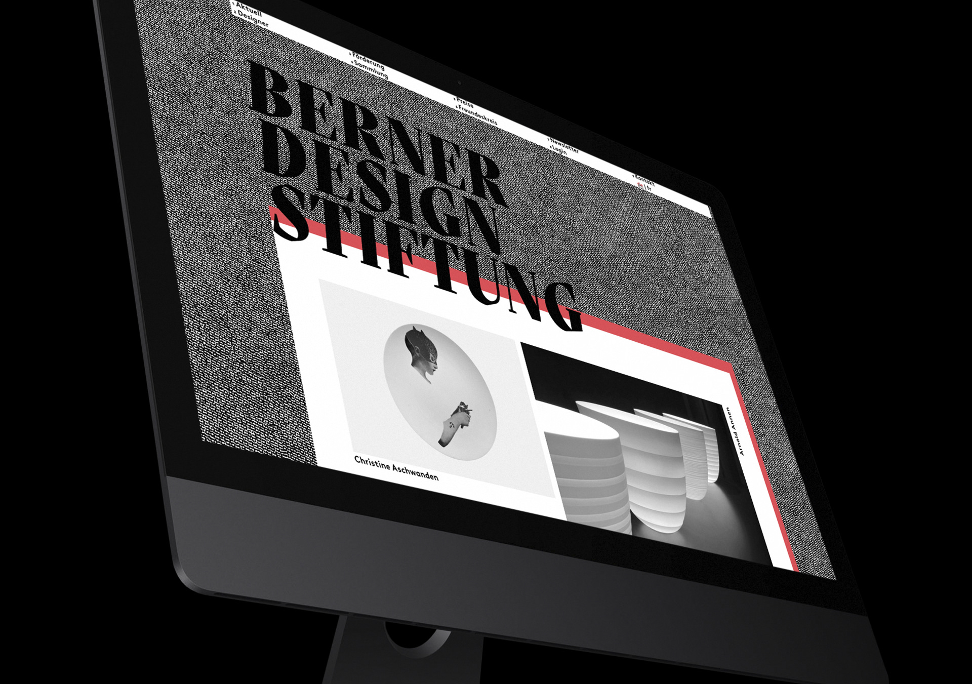
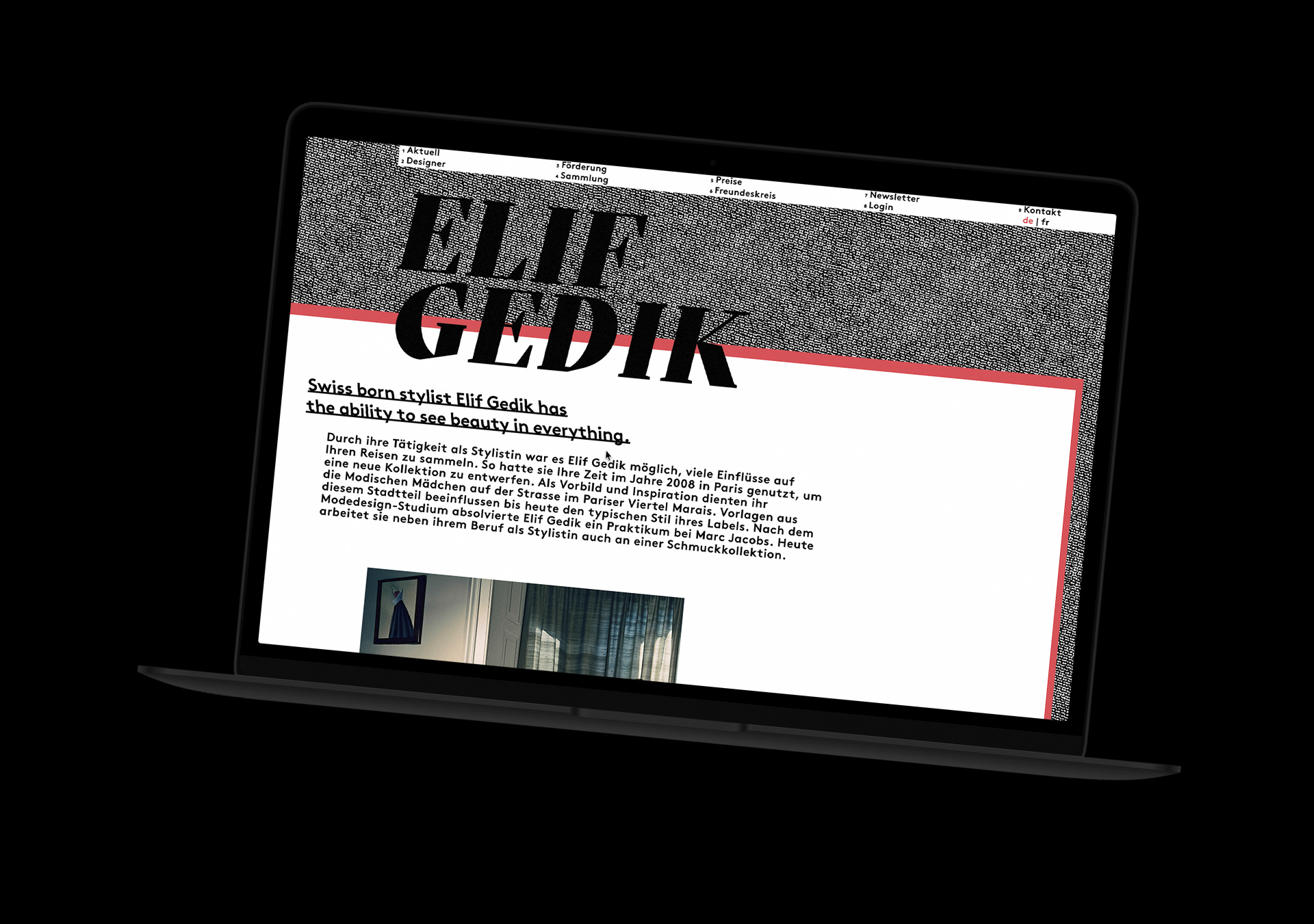
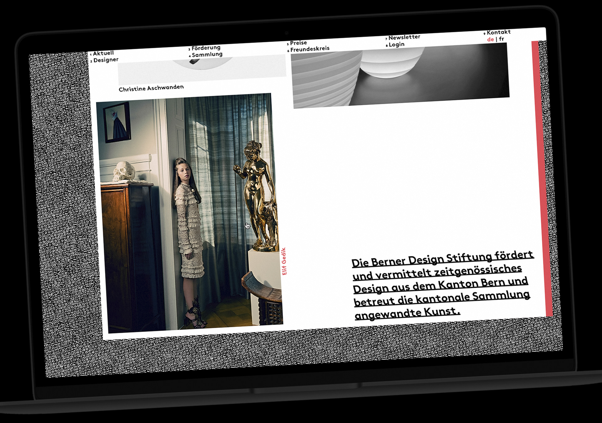
The Design Foundation Bern supports local designers and exhibits their work alongside the collection of historical pieces in the state of Bern. In coalition with the moving to the foundations new local in the historic Kornhaus in the centre of Bern, we created a new and more recognisable brand to boost the foundation's recognition throughout the canton of Bern.
1
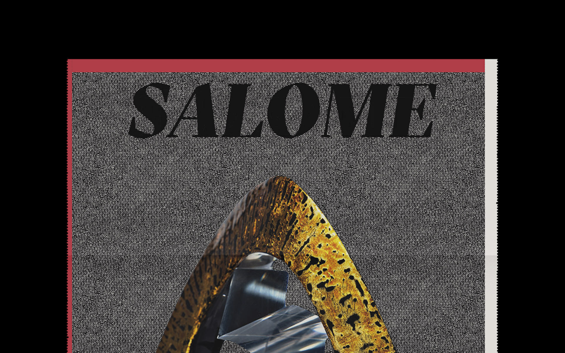
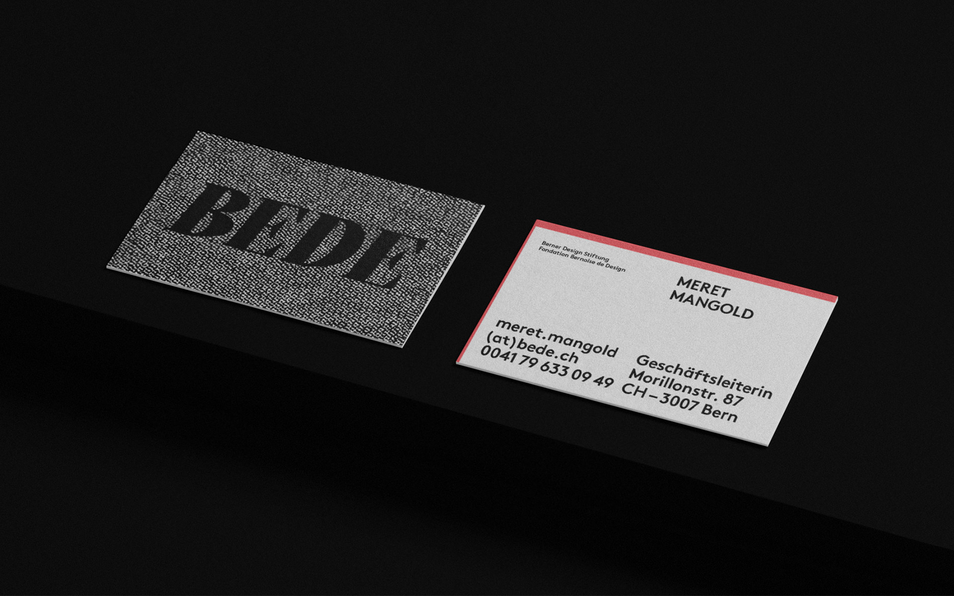
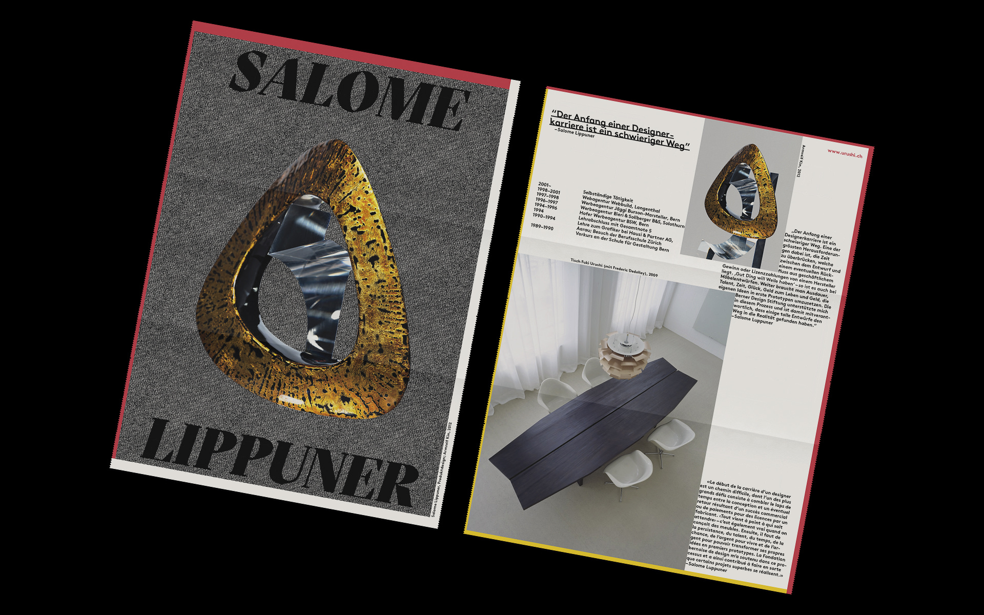
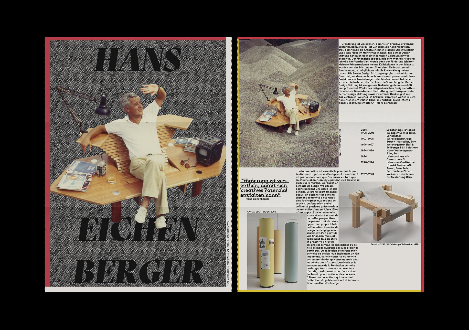
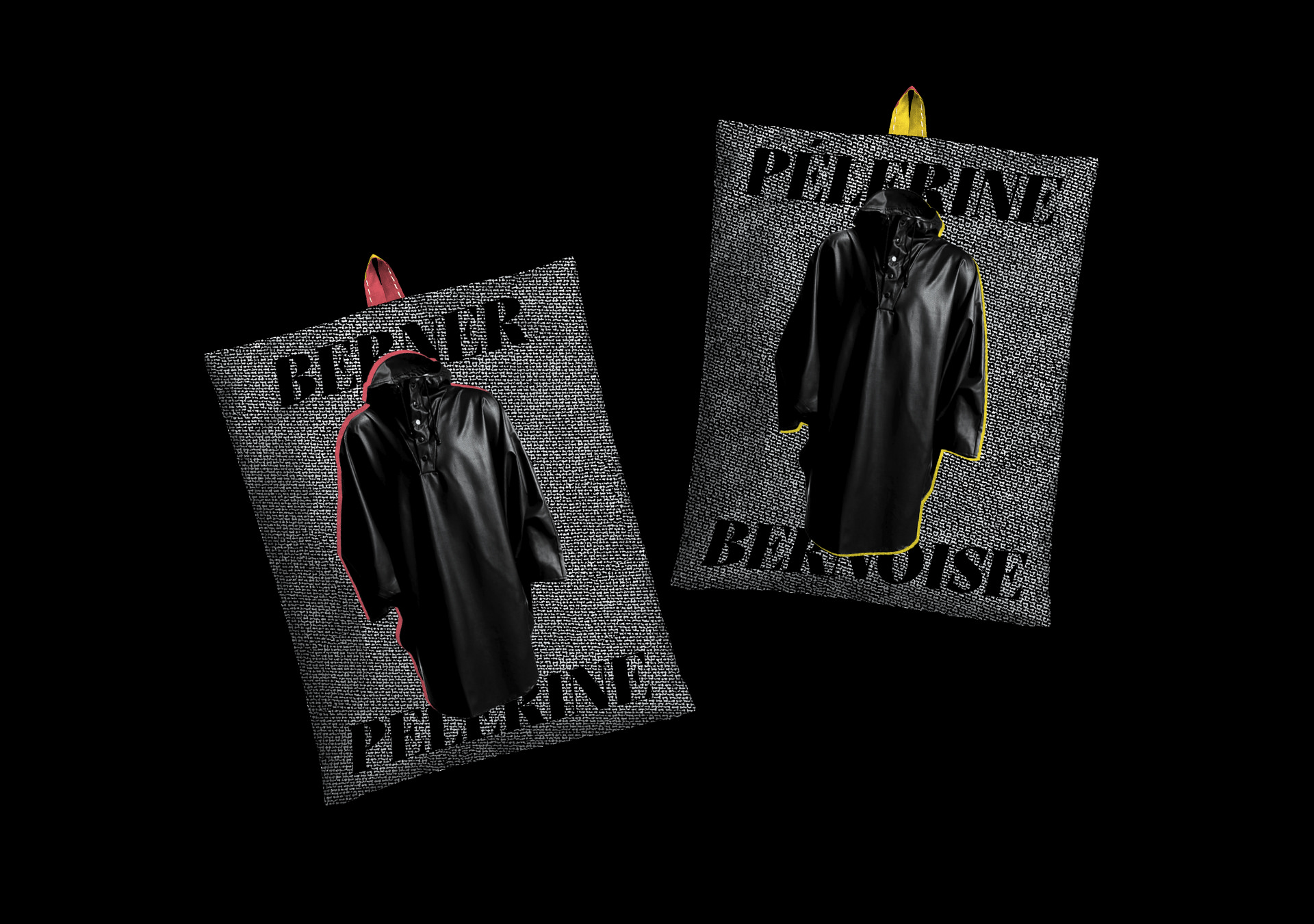
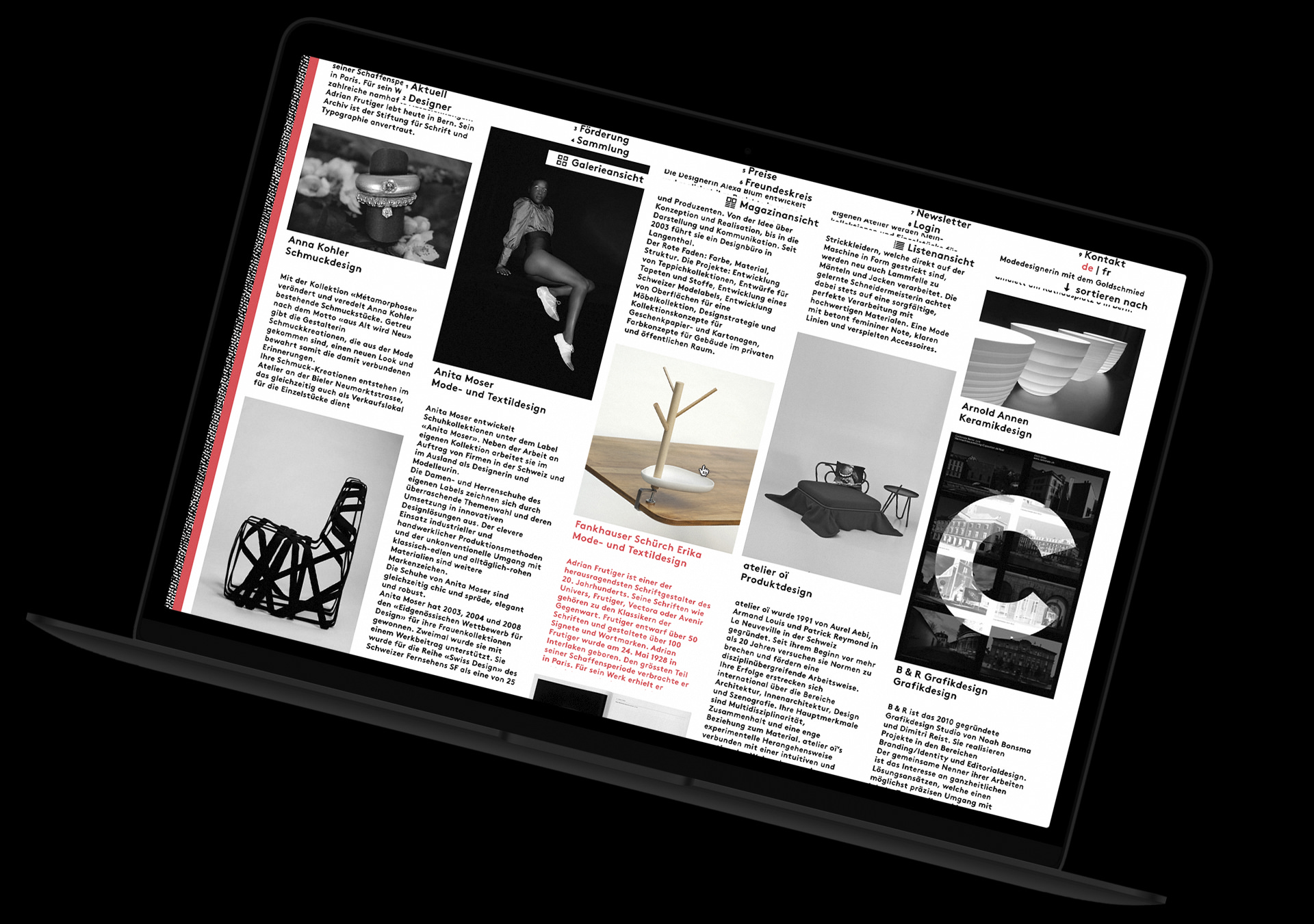
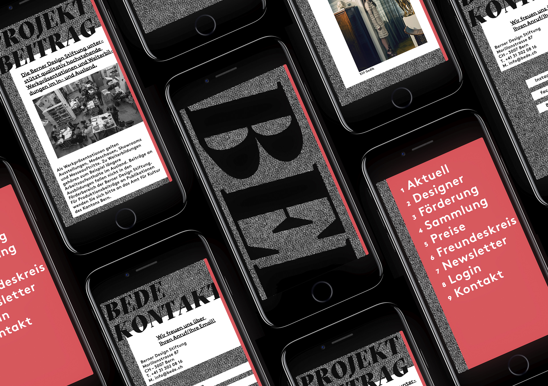
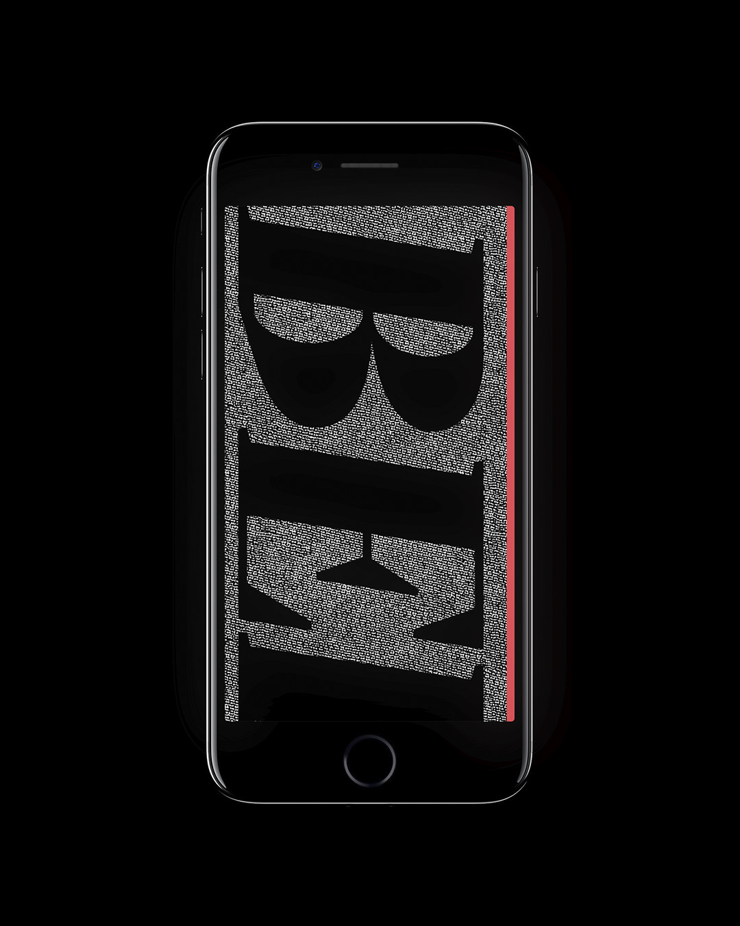
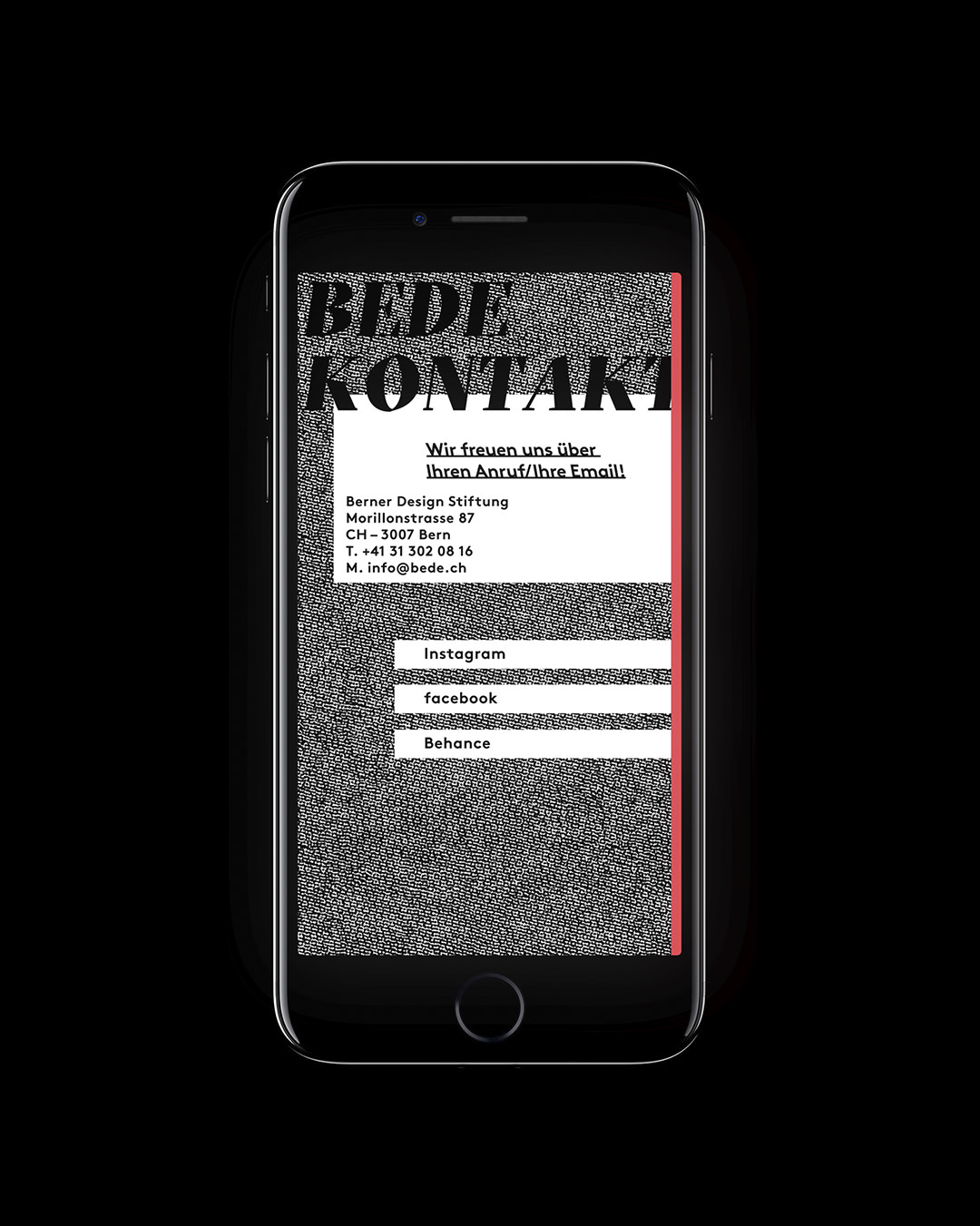
Early on in the project, the decision was made that the brand has no need for a logo but should instead get its recognition through colour, typography and texture. The brand texture is one of the most prominent elements standing in for the different mediums used by the members of the design foundation such as textiles, print rasterisation, stone, etc.
2
The canton of Bern is a bilingual canton. With the large part being German-speaking and a minority of French-speaking. Non the less equal importance was given to both languages. The two languages are represented by the two colour accents red and yellow. Red symbolises artists and works from the German-speaking regions and marks German text as such while yellow does the same to the French-speaking regions and texts.